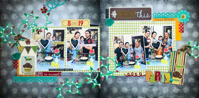
A double page spread is a great way to either fit in more photos or incorporate larger photos while still having space to embellish your spread in a pleasing manner. However, it can be intimidating because you are working on covering a much larger surface and you want the pages to relate to each other in a cohesive manner.
If you are new to creating double page spreads, the easiest way to start is to use the same base paper - either the same colour cardstock or 2 sheets of patterned paper of the same design.
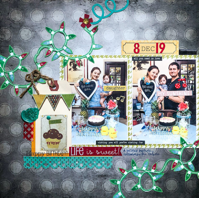
On this layout, I went with 2 sheets of patterned paper of the same design. I used a more muted base paper to really make the photos pop.
Extra tip #1: You can use different base patterned papers if you don't have 2 sheets of the same design. As long as they coordinate, they would be pleasing to the eye.
Extra tip #2: Use papers from a paper pack because they are designed to coordinate.
To ensure continuity between the pages, I used the same elements on both pages. Like the houndstooth paper and the Christmas lights. I matched up the Christmas lights at the center to tie the pages together.
I find it much easier to work on one page at a time instead of both pages simultaneously because I like my pages to be able to stand alone if they ever got separated. Also, working on a single page makes the task at hand a little less daunting.
Once I'm happy with the general layout of both pages, then I work on deliberate ways to tie the spread together through embellishments.
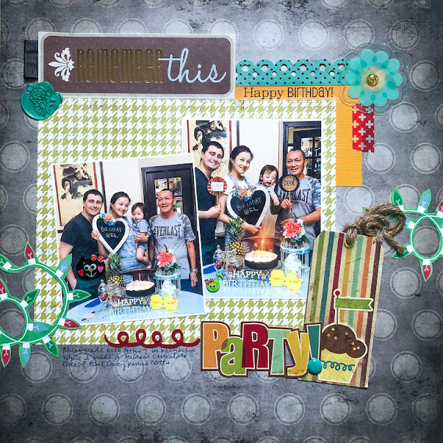
Photos don't have to be put in the same position on both pages. Here on this page, I tilted one of the photos to create more interest (and make it less noticeable as the photos are of different sizes...hehe).
Repeated elements on both pages help guide the eye from left to right, contributing to the overall cohesiveness of the pages. Like the tags on both pages. Even though they are not exactly the same, they are quite similar (twine and cupcake). Or the ribbon tabs. And wax seals.
I also anchored the pages by adding a strip of yellow cardstock plus red washi tape at the bottom left (page 1) and top right (page 2) edges to help with the cohesiveness of the overall design.
I used pops of red on both pages to help guide the eye along the pages as well.
There you have it..how to create a double page...according to me. *winks*
Do you like creating double page spreads? What is your modus operandi for creating great double page spreads? Please share!


4 comments:
I used to ALWAYS make double pages, but haven't in years! I think it's because most collections I get only have 2 of the same paper, and I want to use side 'b' on another LO!! LOL!! I loveeeeeeeee this! LOVING the lights!!!!
I haven't tried 2 pages layout yet, coordinating both sides is no easy feat to me. Thanks for sharing important details of the process, lots of good tips indeed. I would love to see how you store the layouts.
Heaney
What a great double page layout. Thank you for all the good tips. The thought of making the pages able to stand alone is a good idea. I like the Xmas lights that add so much to the overall cohesiveness.
I love that your pages stand alone and yet still look like a cohesive double-pager. I intentionally design mine not to stand alone. I'm not really sure why, other than I want someone to accidentally miss half the story.
Post a Comment
Thanks for visiting my blog and taking time to leave a comment. I really appreciate it. Have an awesome day!:)
Cheers, Yvonne.