Well friends, I've been told that I've a knack for putting seemingly disparate elements in a somewhat cohesive manner on my layouts. Really? I've been scrapbooking for so long now and my only goal is just to use up my stash! But I did a run-through of my layouts to pick out some commonalities that might help you use seemingly disparate elements on your layouts too. *winks*
Are you ready?
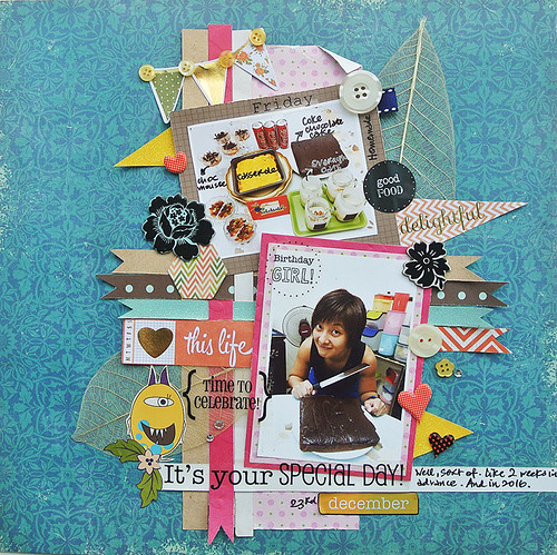
1. Try using paper strips of similar width.
Even if the papers don't match, the paper strips provide a cohesive feel that help tie the pieces together. On this particular layout, the paper fish tails really aid in guiding the eye throughout the layout.
2. Have your patterned paper characters look at your subjects.
This is a technique I use a lot - having fussy-cut patterned paper characters look at my subjects. It is a fun way "frame" your photos.
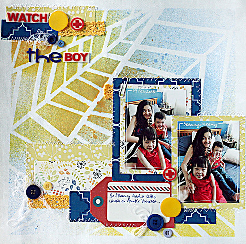
3. Try working with just three main colours.
Keeping to a trio of harmonious colours makes it easy on the eyes even if the patterns seem to clash.
4. Keep patterns in small doses.
Play with little bits of patterns so they serve as little accents and don't distract the eye from your photos.
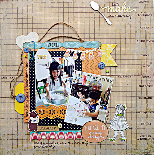
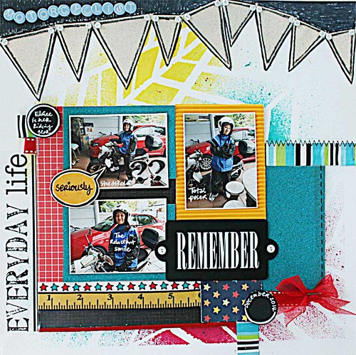
5. Use a grid format.
Somehow laying elements within a grid structure just works because the eye has a "framework" to guide it through the elements.
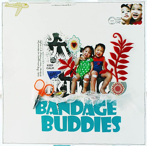
6. Go whimsical.
Well, nothing has to make sense in a whimsical scene so just have fun! Here, I went with a postcard scene and even added props!
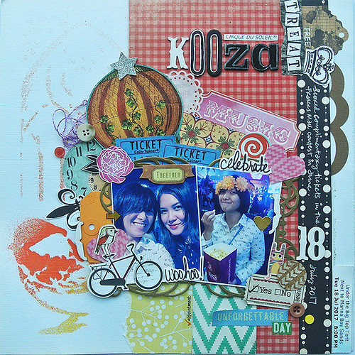
7. Use repeated shapes.
Repetition of shapes - circles and rectangles- provide the eye relief to this seemingly messy layout.
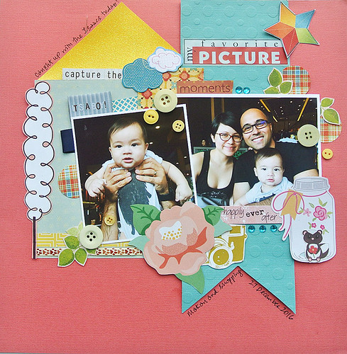
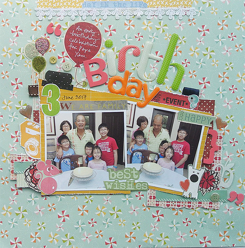
8. Create a decorative "frame" around your photos.
Place all your decorative elements along the perimeter of your photos. This creates a "frame" that ties everything together.
There you have it, 8 ways to use seemingly disparate elements on your layouts. Have you employed any of them on your layouts?
|
Wednesday
How to use seemingly disparate elements on your layouts
Subscribe to:
Post Comments (Atom)
>


9 comments:
absolutely ! I admire your creations and you put them together so easily !
cheers
You give the BEST tips!! These are all fabulous!! And YOU are correct my friend!! Those flowers are familiar!!! *wink* LOL!! And EVERY TIME I have used a bird while de-stashing ... who have I been thinking about?!?!?!? LOL!!!!!!!
You always have the most creative, beautiful layouts and the most fabulous tips!! I need to scrapbook more - you inspire me!! Have a great day!! Big hugs :)
Lisa
A Mermaid's Crafts
I love these round-up posts of yours. Excellent tips, as always!
your layouts are always so fun.. I wish I could put together scrapbook pages like you. Thanks for the tips. Your awesome. :)
So yeah... I haven't been here in such a long time... but I have been thinking of you as I've been using some of the beautiful items you've sent me in the past lately.. you have such a beautiful style and you are the queen of adding all kinds of stuff and these are all just beautiful pages and awesome tips! I'm hoping to apply some of them soon... maybe tomorrow! A scrapbook page??? Say it isn't so... thanks for the inspiration..
I did it! I did it! It will post tomorrow.. so like 12am.. about 8 hours from now... thanks for the inspiration Yvonne!
You most certainly do have an amazing talent for combining elements! I am always in awe of your designs that are playful, happy, and soooo striking! Thanks for sharing your tips with us!
Hi Yvonne......I've come from Lisa's blog. This is a great post, thank you for all the awesome tips! You have an amazing talent with combining different elements. Fabulous pages! I'm off to do some stash busting :)
Post a Comment
Thanks for visiting my blog and taking time to leave a comment. I really appreciate it. Have an awesome day!:)
Cheers, Yvonne.