 |
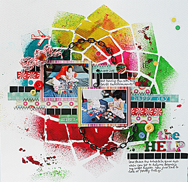
| My little helper |
1. Go with bold colours in a graphic pattern.
Strips of paper scraps helped to anchor the photos and smaller circular elements (buttons and brads) helped to tie the elements together.
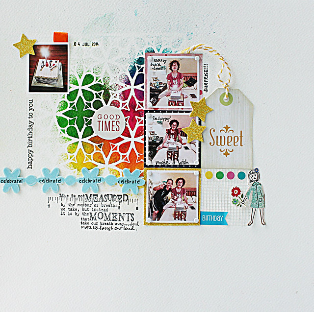 |
| Birthday cake in bed |
A grid makes it easy for you to place your elements. Repeated elements like the floral design complete the visual triangle (the misted background, the strip of foam blooms and the girl holding a bloom) and pull the composition together.
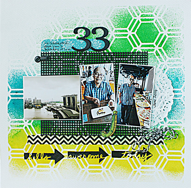 |
| Lunch at Level 33 |
3. Extend the colours from your photos.
Tie the elements together by using a strong grounding colour like black. Black and white is an optically arresting combination with powerful graphic qualities.
Tie the elements together by using a strong grounding colour like black. Black and white is an optically arresting combination with powerful graphic qualities.
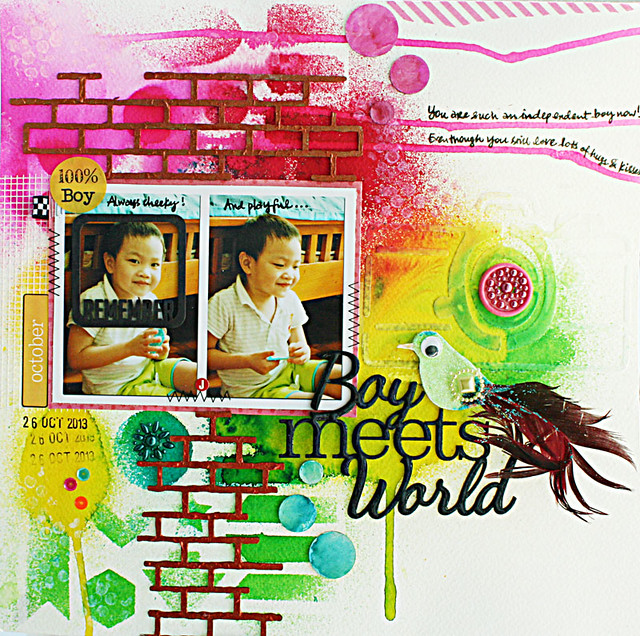 |
| The super cheeky phase |
Here the drips from the Dylusions mists helped to guide the eye both horizontally and vertically. Try tilting the paper or blow using a straw.
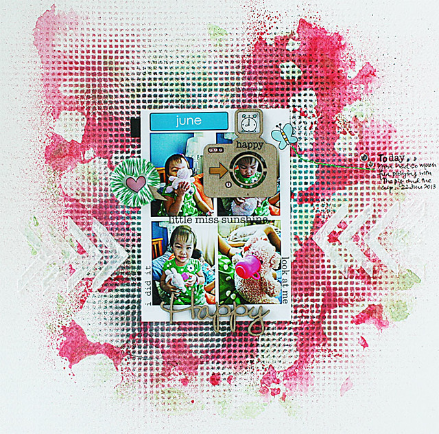 |
| Happy miss sunshine with her milk-drinking pig! |
The repeated elements here create harmony even though the background is a little messy.
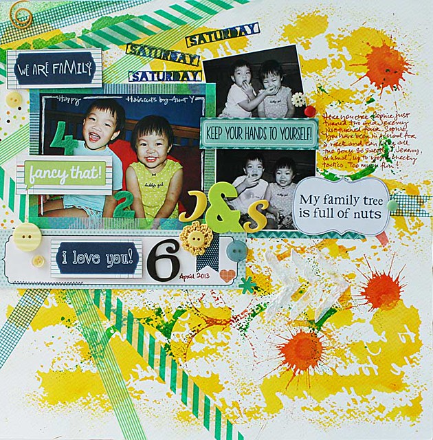 |
| My new "skill" |
Diagonals can add movement and help to guide the eye across your layout. The washi tape, stamped words and tilted photo helped to tie the elements together even though the background is a little noisy.
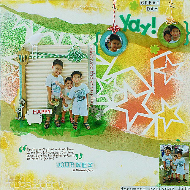 |
| A whimsical scene |
Make the bold background the backdrop of your fun "scene".
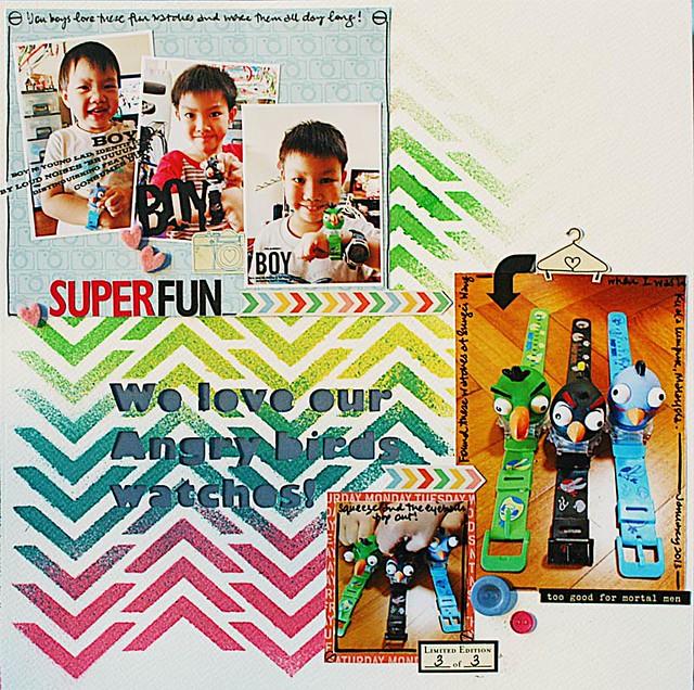 |
| Their eyeballs pop out |
8. Play with a chevron design.
One powerful design element combined with the power of "threes" (three boys, three watches, three photo blocks) pull the elements together on a relatively simple layout.
 |
| That sweet smile and flat nose |
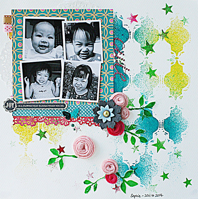
9. Go with black and white photos.
The contrast of black and white photos against a bold background always create a visual impact.
 |
| The one about the shy guy |
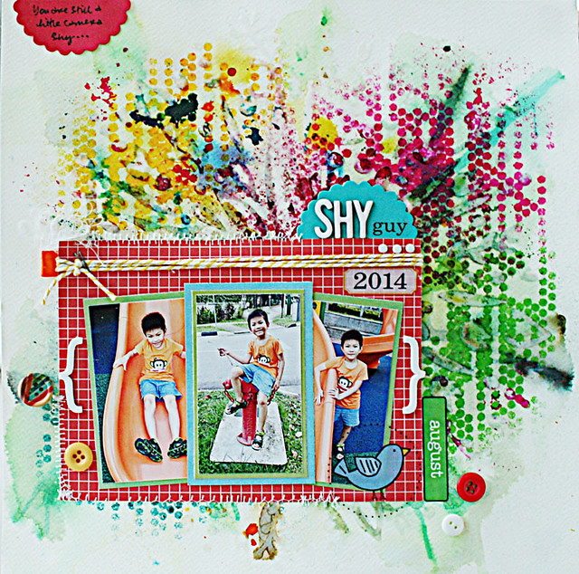
Have a little fun creating your own custom patterned paper. A starburst stencil was first applied with some gloss gel, then coloured with Ecolines (liquid water colours). Next, Dylusions inks sprays were applied with another stencil to create an artsy messy background. The rectangular photo mat helped to anchor the focal point and serve as a dramatic contrast to the background.
There you have it. 10 ideas for creating bright and bold backgrounds for your layouts. Which one caught your eye? *winks*


16 comments:
These all look wonderful! Bold bright backgrounds! Cannot pick a favourite! Love each one!
Wow !! All your layouts are super duper awesome. How creative you are with the background ideas !
Love how you often do 'rainbow' colours cascading down with the stencils...looks BRILL....the chevron one really attracted me. Errrm....I rather like big bright bold colors. Did you notice????!!!!
You always create the MOST amazing backgrounds with gorgeous colors!!!!!!!!!!!!!!!!!!!!
So many ideas....very inspiring!!
Cheers
Dr Sonia
This is really interesting article, thanks for sharing :)
You have a way with colors Yvonne !! really can not pick a favorite...all look awesome :)
OMGosh, you really are amazing, my friend! These are all SO gorgeous, so vivid, so playful, so bold! You combine elements like no other!
They are all absolutely amazing!! The colors are fabulous!! Too hard to pick a fav!! They are all creative and beautiful!! Have a great day :)
Lisa
A Mermaid's Crafts
you always rock bold and bright. all of these layouts are outstanding and designed perfectly..
your background colours are always awesome and very beautiful layout designs
Gorgeous layouts...I'm so impressed even if this is the second time I'm seeing some of them. You have mad artistic skills! They are all eye candy for my mind....thanks!
What a wonderful collection of your pages, Yvonne! Each one is a beautiful work of art! Thank you so much for your amazing tutorial!
Stunning layouts :)
They all look great!
Wow Yvonne, all of these backgrounds are so pretty and each one so different. I am such a chicken when it comes to things like this... it is all about control for and letting go. I love love the look of this on other peoples layouts but when I do it I always think is just looks like a mess. I want to control it and I can't :D THank you for the inspiration.
Post a Comment
Thanks for visiting my blog and taking time to leave a comment. I really appreciate it. Have an awesome day!:)
Cheers, Yvonne.