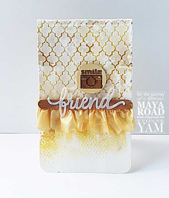
I love making monochromatic cards because they challenge me to think about the execution of the design since I don't have other colours to "distract" the eye.
When it comes to monochromatic cards, the key is in mixing up the textures so that the eye is guided through the various elements. On this card...
1. The cold-press watercolour paper base provided texture which was captured with the ink splatters.
2. The light modeling paste created a dimensional backdrop with the stenciled design.
3. The subtle gold shimmer on top of the modeling paste gave #2 a little more depth.
4. The ice-cream stick had a subtle woodgrain texture which contrasted well with the vellum die-cut word 'friend'.
5. The scalloped ribbon softened the feel of the card.
6. The wood token helped to complete the visual triangle.
What do you think?


14 comments:
very elegant card Yvonne, how did you avoid the texture paste soaking in some color here ?? do tell me
Double take.... ICECREAM stick!!! Fabulous:) LOOOVE it when you go mono!!!
This is totally swoon worthy, Yvonne. What an absolutely gorgeous card !!
Yes to monochromatic. This is gorgeous...I especially love the effect of the stencil...wow.
So gorgeous! LOVING the simple but bold colors!!!!!!!!!!!
wow this is amazing.. i love the texture you added..
Absolutely gorgeous!! The texture is amazing!! Ice cream stick - I love it!! Have a great day :)
Lisa
A Mermaid's Crafts
Such a totally elegant card! Sooo BEAUTIFUL
1
This is so inspiring!
Yum! I think it's absolutely beautiful, Yvonne! The color, the texture, the design... everything!
Gorgeous! I love all the fabulous textures!
Mesmerising !! You rock the monochromatic look :)
This is BRILLIANT!!
I adore this. It's so pretty and elegant.
Post a Comment
Thanks for visiting my blog and taking time to leave a comment. I really appreciate it. Have an awesome day!:)
Cheers, Yvonne.