You know how much I love to incorporate both black and white photos and coloured photos on my layouts. Sometimes it's because I don't have very well-taken shots - turning them into black and white tends to eliminate lighting problems - other times, it's because I have similar consecutive shots and want to differentiate them. Or sometimes I just use the contrast as a design element to create interest on my layouts. Here are some ideas for incorporating black and white photos with coloured photos on your layouts.
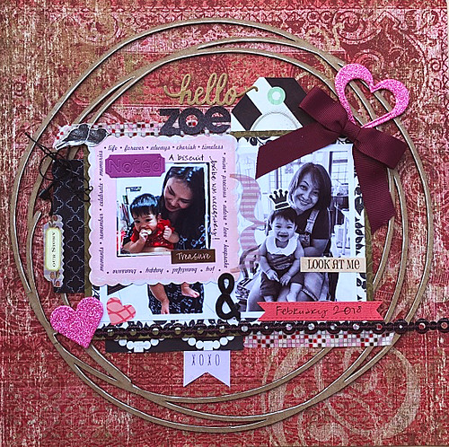 |
| The one about carrying Zoe (and not making her cry) |
On this layout, the coloured photo features me with my niece Z while the black and white photo depicts my sister E with my niece Z. The photos were taken a day apart with the coloured white taken at night (note light reflections on hair) while the black and white photo was taken the next day in natural daylight.
Since it was difficult (time-consuming) to adjust the photos to "match", I just printed them in different colour formats and used embellishments to create a somewhat cohesive layout.
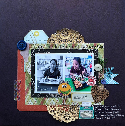 |
| Someone had 2 mains for dinner (not me!) |
2. Do a "before" and "after".
This layout features my sister E looking very "sad" in the black and white photo because her main arrived much smaller than expected while the coloured photo features her looking much happier with the considerably bigger second main she ordered.
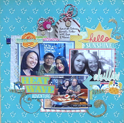 |
| The heat wave adventure |
I love the photo of my sister and I except for the glaring light in the background which got considerably toned down once the photo was converted to black and white. Not perfect but our faces still looked decent [that's my story and I'm sticking to it! *LOL*]
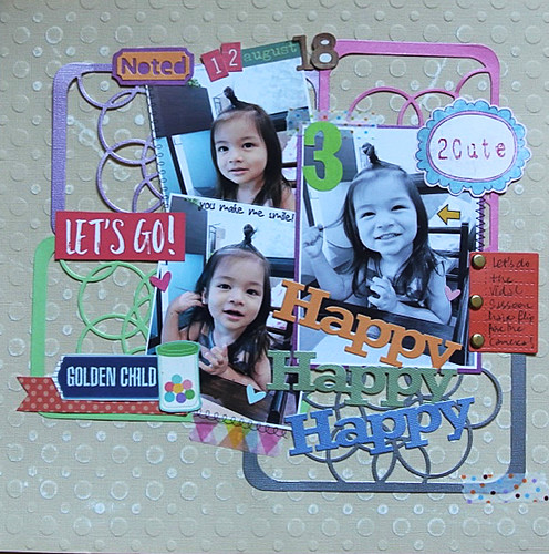 |
| The one about the vidal saasoon hair |
Here I wanted to feature several consecutive shots of my nephew E before we got to "the ONE". :)
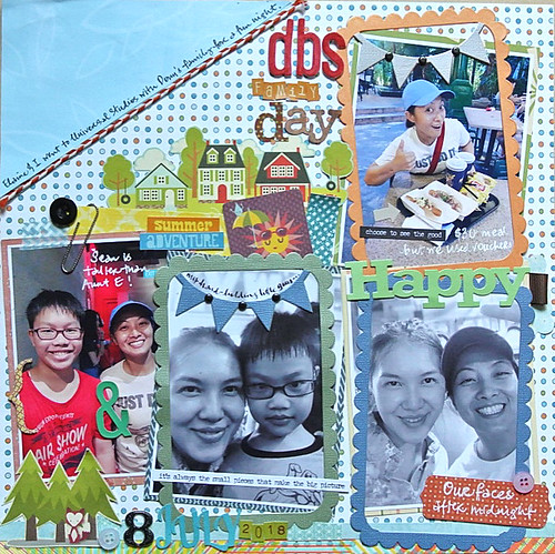 |
| We went to Universal Studios Singapore! |
Sometimes when you try to fit a few large photos (4x6) on a single page, along with a whole lot of other colourful elements, the eye can get a bit lost...help it along by toning down the layout with some black and white photos.
 |
| Chocolate spells love in any language |
Here we had some lighting issues with the photos we took at nephew #1's birthday party which I discovered only after we ate the cake (hahaha!). Thanks to Photoshop, I did salvage some photos to scrapbook. I lowered the contrast levels for a "dreamy" feel to the photos and then used bold colours on the rest of the layout. Could you tell???
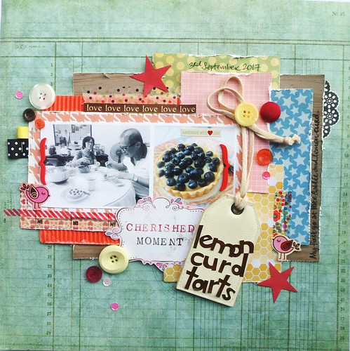 |
| The one about the lemon curd tarts |
Here on this layout, I had a shot of the folks eating the lemon curd tarts that wasn't that great but since it helped to tell the story a little better, I had to incorporate it. I just toned it down by converting the shot to black and white and reducing the contrast levels.
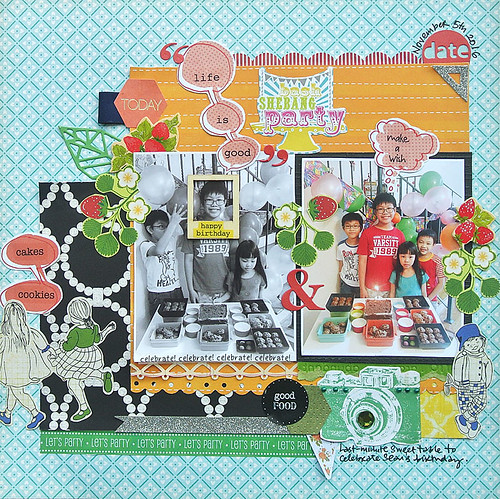 |
| The Tupperware Party |
Well you know my struggles with taking photos of the Gangster Gang (aka niece + 3 nephews) so I usually have more outtakes than decent shots. Here, nephew #1 was still smiling happily at the camera so I "salvaged" the photo by framing his face...and you can still see the rest of the background action with nephew #2 and the niece.*winks*
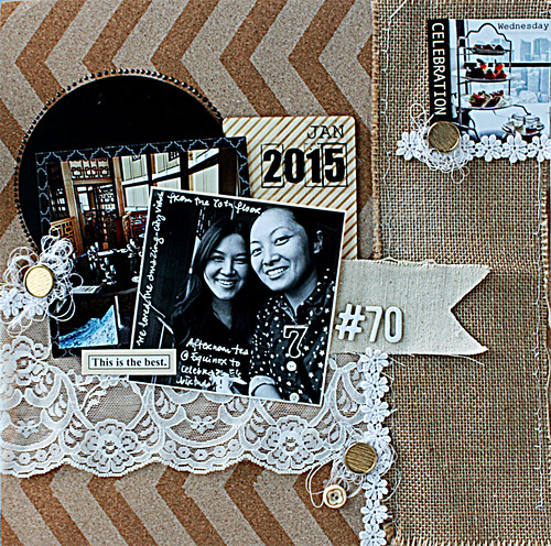 |
| Afternoon tea |
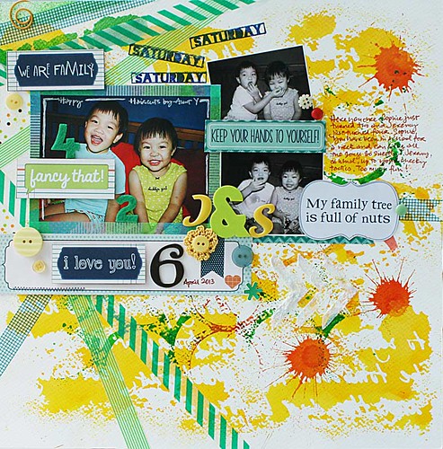
When the rest of your elements are fairly neutral, incorporating a high contrast black and white photo can really make the photo stand out.
 |
| My new "skill" ,....and a challenge winner! |
Print your focal point in larger size to really help the eye zoom in on your main photo. Here I printed the outtakes of nephew #3 and the niece in black and white in a smaller size so as to not detract from that cute main photo. But the outtakes do help to tell the story on my layout (plus they were so cute!) so I incorporated them. :)
There you have it. 10 ideas for incorporating black and white photos with coloured photos on your layouts. Which one is your fave?


8 comments:
These are AWESOME ideas!!!!!
They're all so amazing and creative and spectacular!! Fabulous tips, too!! Have a great day!! Big hugs :)
Lisa
A Mermaid's Crafts
Beautiful fun layouts...all of them! Love the idea of mixing color w/ B&W.
This is my first visit to your blog, despite years of seeing you comment on Cindy's blog,and I am in awe of your talent (why did I wait so long ::doh::!)
New Follower!
Geez, Doreen, it's about time! ;) Yvonne is awesome. Love the tips for B/W. I think my favorite is now & then, or before & after.
Cindy - Hahahahahaha! Too funny and too true!
Picking a favorite layout is like asking me to pick my favorite child. There is something special in each one.
Love your ideas, Yvonne! Such great tips for incorporating those less than perfect photos, or uniting photos that don't otherwise match. And of course all your layout designs are absolutely adorable, too!
Your exceptional article has made a lasting impression on our platform, and we want to express our sincere appreciation for your valuable contribution. Your insightful perspective consistently enriches our discussions, bringing depth and meaning to the forefront. We are truly thankful for the expertise you provide through your work. For a memorable stay in Mukteshwar, we recommend immersing yourself in the tranquility of Devine Retreat, where every moment promises serenity amidst the captivating landscape. Should you have any questions, please do not hesitate to reach out to us.
Post a Comment
Thanks for visiting my blog and taking time to leave a comment. I really appreciate it. Have an awesome day!:)
Cheers, Yvonne.