Friday

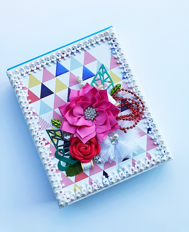
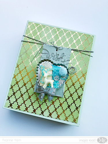
The last decorated box of 2017


The-last-decorated-box-of-2017

Well, time seemed to have gotten away from me this week. And last week. *hangs head in shame*

I've been spending every free moment decluttering, organizing and spring-cleaning my home. But I did want to share with you the last decorated box of 2017. :)


Yep, it's one of those Kikki K planner boxes...you know, because I'm a planner collector too. What can I say? I like stuff. *LOL*


A piece of DCWV patterned paper and a clustering of my fave embellishments from Maya Road. :)


As always, my fave leaf die-cut makes an appearance. Have you noticed how often I've used it this year? *winks* 


Just wanted to say a big "thank you" to you, friends, for always stopping by my blog and leaving me some love. Much appreciated. Really. :)

Happy holidays! Enjoy the rest of 2017...see you in 2018!

Share/Bookmark

Pin It

Thursday

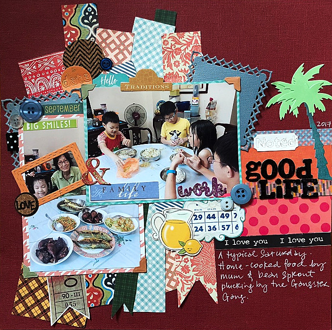
Packing on the paper scraps...on a layout


Packing-on-the-paper-scraps

Yep, it's that time of the year again..when I take stock of my patterned paper scraps, realize that this is NOT the year I finish using up my paper scraps, then proceed to pack on the paper scraps on a layout in a feeble attempt to make the scrap pile just a little bit smaller. And failing miserably of course. *LOL*


So, this is what a typical Saturday looks like at home - a home-cooked lunch by mum and making the Gangster Gang (nephews + niece) do a little monotonous work like plucking bean sprouts....while I manage QC (quality control) of course.*winks*


Playing along with Stuck?! Sketches.


Share/Bookmark

Pin It

Tuesday

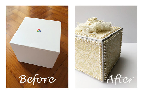
The upcycled router box (tutorial)


An-upcycled-router-box
So the other day my dad got me a new wireless router for my room and of course, I was more excited about the sturdy box the router came in...*LOL*

Now, don't get me wrong, I love high-speed WIFI for sure but every time my dad tries a new router, it kind of messes with the chi a little and I lose connectivity for a while.


Let's talk about this lovely sturdy box that is all white and only has the Google logo on the top of it. Yep, so totally meant for decorating. :)


I measured and cut out patterned paper for all 6 sides of the box, ran the papers through my Xyron Creative Station and glued them on the boc.


Next I glued Maya Road pearl trim along the edges. There were 6 sides to the box and after my last mishap with the glue gun, you know I went SLOW with the gluing...*hahaha* It took like 2 hours! [Okay, I injured the index finger on my right hand the day before so it's all plastered up and that slowed things down considerably.]


I decided to make a big bloom with some remnant fabric and lace.


A little twisting and gluing of the fabric and lace and you have a decent-looking bloom. 


The last step is to glue the bloom to the lid of the box. 


I think this box turned out pretty elegant eh? *winks*


Share/Bookmark

Pin It

Friday

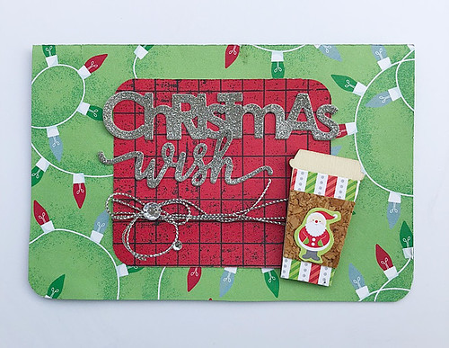
A Christmas card for the Coffee Lovers Winter Blog Hop


A-Christmas-card-for-the-Coffee-Lovers-Blog-Hop

So, the Christmas presents/cards have been given out/mailed this week. It was not looking so good earlier...*LOL* I even had time to whip out a Christmas card for the Coffee Lovers Winter Blog Hop. :)


This card came together quickly...I went with this Maya Road wood coffee cup as my "focal" point and just pulled together matching patterned papers.


Next I went into my diecut box for the sentiment and added some silver twine and bling for texture.


Happy weekend friends!


Share/Bookmark

Pin It

Monday

Tag on a gift box


Tag-on-a-gift-box-by-Yvonne-Yam-for-Maya-Road

Sometimes when you are pressed for time, all you need is a decorated tag to "dress up" your gift box. [Says the person who is still frantically wrapping Christmas pressies at the moment. *LOL*]


Never mind that I bought the gifts months ago and started decorated my gift boxes months ago...I am not ahead in the game my friends. Anyone in the same sorry state? *panic mode*


Just a super quick tag on a gift box project for Maya Road. It's a great way for the recipient to re-use the gift box and the tag. :)


Share/Bookmark

Pin It

Thursday

Fun colour combo on an upcycled mooncake box


Fun-colour-combo-on-an-upcycled-mooncake-box

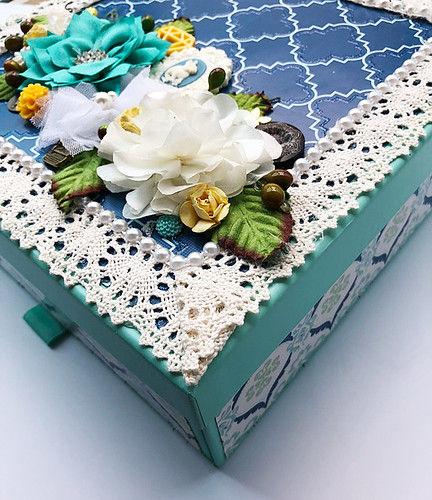
This was one of the loveliest mooncake boxes I'd gotten this year. The aqua box opens up via a pull-out drawer.  I decided to use a fun colour combo to decorate the mooncake box.:)


For the cover of the box, I created a "frame" with patterned paper and added a decorative lace plus pearl trim border before embellishing with pretty embellishments.


It was a fairly quick project since I used patterned papers from a DCWV stack (everything is coordinated). I just picked the ones I wanted, cut them to size and run them pieces through my Xyron Creative Station for an even layer of adhesive.


Then I whipped out my hot glue gun and just went crazy with the embellishing. I'm glad I was a little adventurous with this fun colour combo....those pops of yellow just make me happy! *winks*


Share/Bookmark

Pin It

Monday

The one about the free lunch


The-one-about-the-free-lunch

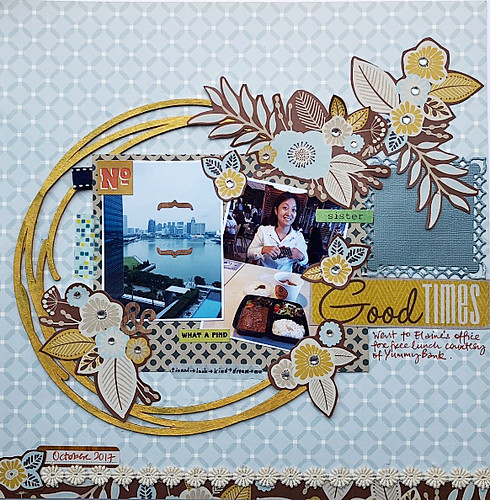
My sister is the "deal" queen. She's always discovering new value-for-money or even free deals! Last month, we enjoyed a free lunch courtesy of Yummy Bank. :)


Okay, so the view from her office is way better than the lunch. But it's free! *LOL*


Trying out a subtle colour scheme for a change....It's so hard! I soooooo wanted to add bright colours. 


I tried to compensate with gold-painted chipboard and clear bling. Did it work? *winks* 


Playing along with Stuck?! Sketches.


Share/Bookmark

Pin It

Wednesday

Makeup organizer


Makeup-organizer

So friends, I'm a little late to the game but I've just discovered the wonderful world of makeup! Now, I've been wearing the really basic stuff - a light foundation with high SPF, a little shimmer on the lids (you know I love my glitter!), a neutral blush and lipstick. But apparently, I've been missing out on stuff like bronzers, contouring and highlighting kits, eye liners and mascaras, finishing powders, concealers et cetera. 

Eh, I've amassed quite a few things in the last 3 months.*winks* 

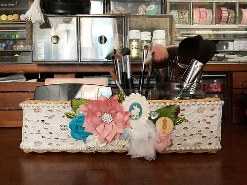
Say hello to my makeup organizer. :)


It's just one of those old baskets lying around the house. The fabric covering it was looking a little worn so it was time for a makeover! Plus it was perfect for storing my makeup palettes and brushes. I covered it with remnant lace fabric...


And then embellished with my fave Maya Road embellishments.


Yeah, my niece S and I are addicted to watching YouTube makeup tutorials on Saturdays. The poor kid has to wait like a decade before she can touch the stuff though...*LOL*

I'm sure I will outgrow this little basket makeup organizer soon though. You know how I am when I get obsessed...and makeup is essentially art supplies for the face right? *high fives all around*

P/s: Sorry for the late post this week, having some technical issues uploading my camera photos to my Mac. These are iPhone photos.


Share/Bookmark

Pin It

Thursday

How to use seemingly disparate elements on your layouts (part 2)


I love using bits of found and random stuff on my projects and try to make them "work" somehow. I shared my tips on how to use seemingly disparate elements on your layouts back in August. Here is Part 2.

My-little-helper
My little helper

1. Use a dark grounding colour to help guide the eye across the layout.

On this layout, I repeated the black paper strips as markers to guide the eye across the photos right down to the titlework and journaling.

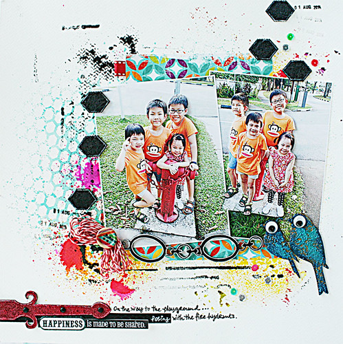
Three-boys,-a-girl-and-a-fire-hydrant
Three boys, one girl and a fire hydrant
2. Create a "frame" with your elements.

Here I used the chipboard pieces - the hexagon ones and the birdies - to "frame" my photos.

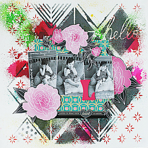
Layered-stencils-layout-by-Yvonne-Yam-for-The-Crafter's-Workshop
Mixing the new with the old
3. Go with the visual triangle.

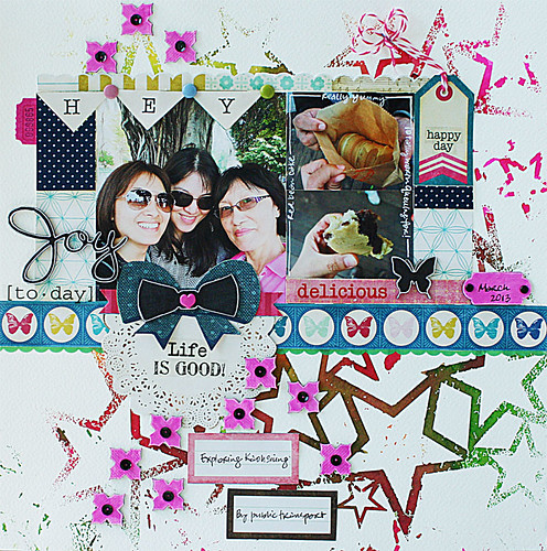
On this layout, I played with the visual triangle in a couple of ways  - a. I placed the photos within a triangle; b. The fussy-cut big blooms form a triangle to "frame" the photos; c. There are triangles in the misted background design. 


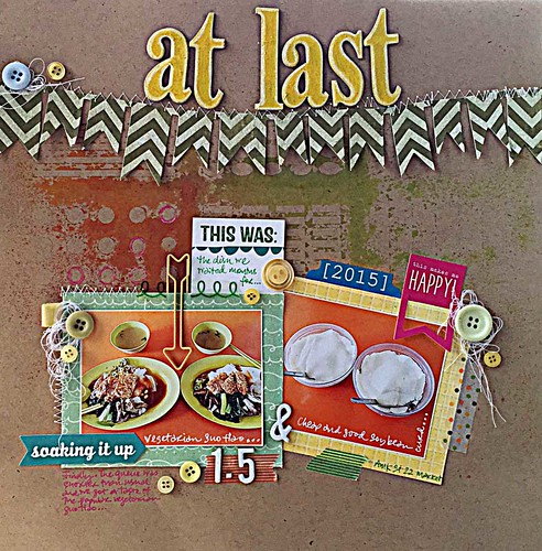
At-last
At last
4. Play up a shape by repeating it on your layout.

Repeating a shape on your layout helps to tie everything together somehow. Here I used the circle shape - in the photos, the buttons, the circles on the misted background, the circles on the polka-dotted washi tape. 


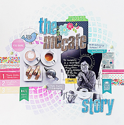
Why-we-need-an-umbrella-indoors-The-McCafe-Story
Why we need an umbrella indoors: the McCafe story
5. Make it look like an advertisement.

Incorporate a product shot (the food) and a user shot (my mum), throw in a testimonial ("It's so sunny in here!"), a summary of the main selling features (#1 - 3), a caption to draw the viewer in (The McCafe story) and finish with some happy elements (bird and flowers) and colours.


The-red-bean-cake
The story about the red bean cake
6. Use one colour to guide the eye.

It may not be obvious here since my layout is so colourful but I used the hot pink throughout the layout as a visual marker for the eye (the chipboard flowers, the ribbon center and sides, the scroll chipboard, the ticket tab).


Layout-by-Yvonne-Yam-for-Maya-Road-Ruby-Rock-It-Swap
A layout by Yvonne Yam for Maya Road/Ruby Rock-It swap
7. Go with the pinboard format.

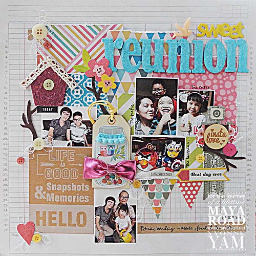
You know how it is with your inspirational board at home - you just put stuff you like on it. Apply it to a layout and you have a bunch of random stuff that somehow works together! *LOL*


There you have it. Another 7 ways to use seemingly disparate elements on your layouts. Do you use any of them?


Share/Bookmark

Pin It
>
Related Posts Plugin for WordPress, Blogger...

LinkWithin

Pin It