You know how I love big bold punches of colour. But sometimes, I gravitate towards soft subtle pastel colours too. Here are 10 ideas for using pastel colours on your cards.:)
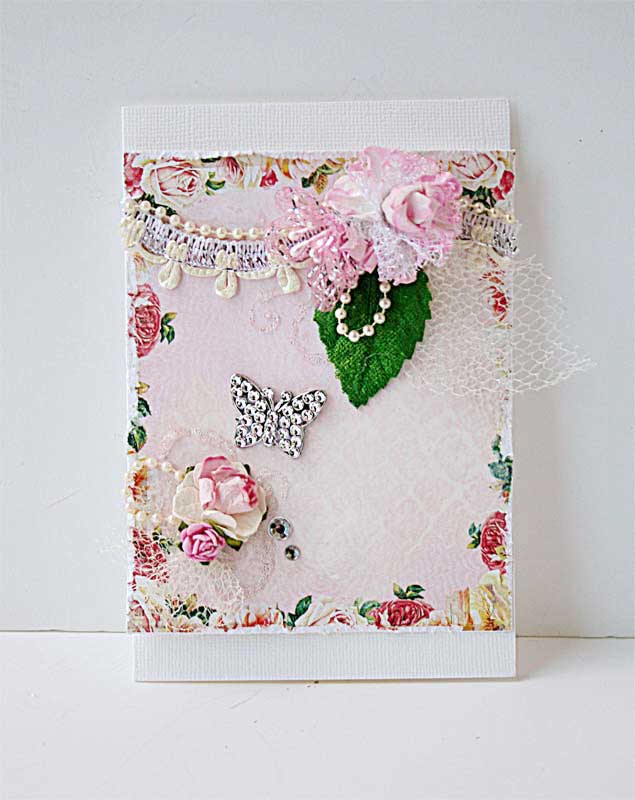 |
| Can I stick to the supplies I pulled out? |
1. Use pretty patterned paper and add dimensional elements to echo the patterns.
 |
| Thanks PaperCrafts and Scrapbooking magazine |
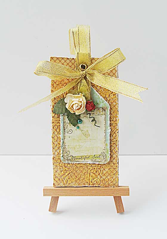
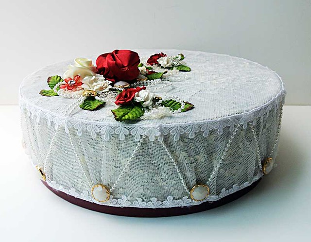
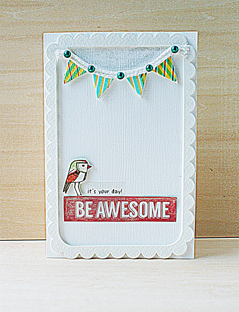
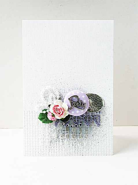
2. Play with different textures on your card.
 |
| A quick mixed media card |
3. Try a little stenciling with light modeling paste and a watercoloured effect for the leaves, then add dimensional flowers.
 |
| A shaker card |
4. Make a shaker card with your sweet pastel sequins.
 |
| I see more shimmering projects in my future |
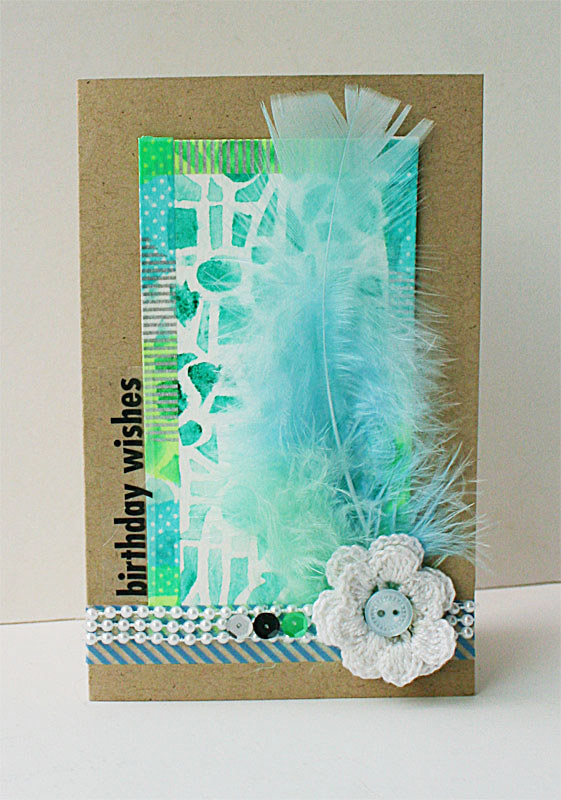
5. Tone down bright colours with a shimmering Wink of Stella pen.
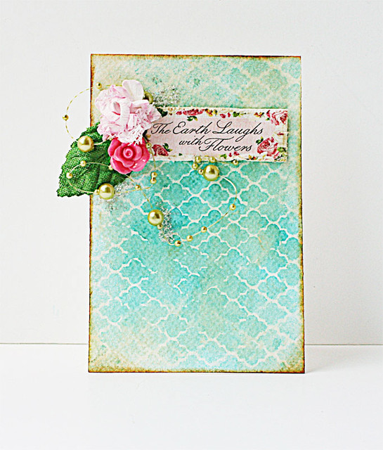 |
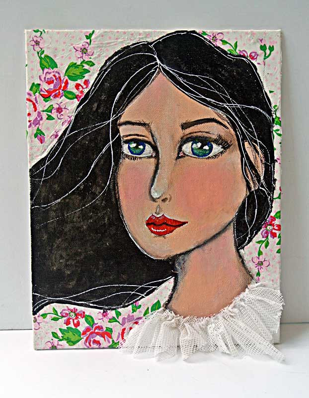
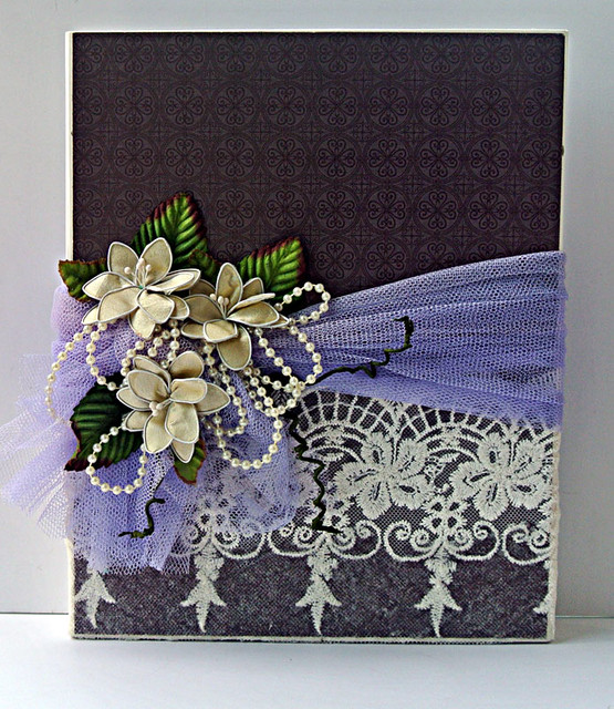
| The earth laughs with flowers mixed media card |
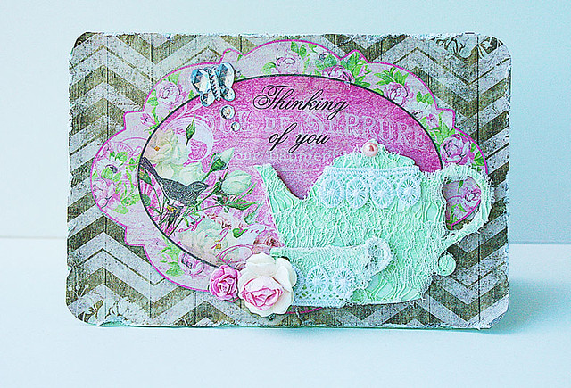
6. Go for a vintage vibe with tea-stained paper.
 |
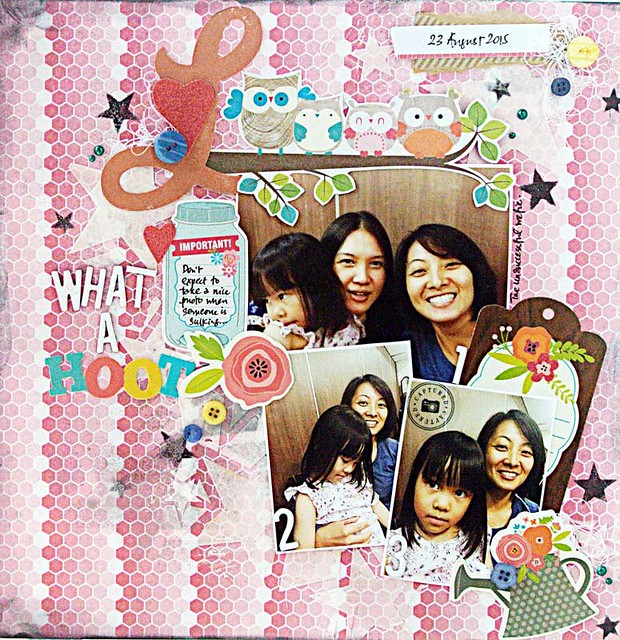
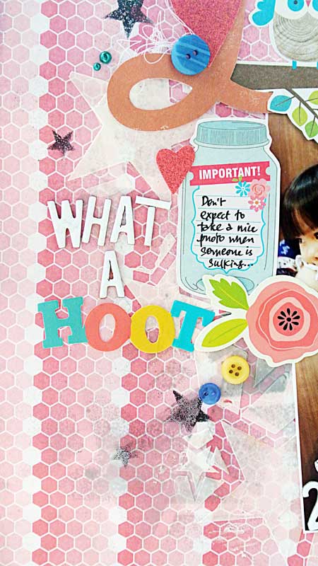
| Card for Lynnda Hosni |
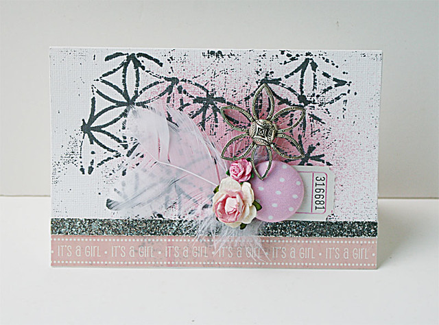
7. Try out a pink and grey/silver combo.
 |
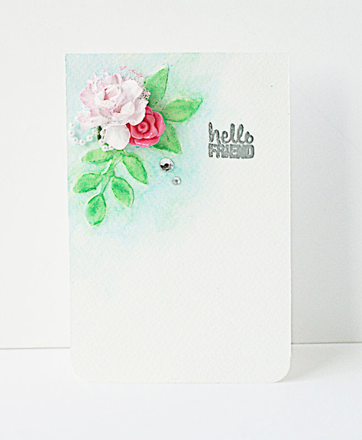
| White space makes an impact |
8. Use white space to amplify the soft pastel colours.
 |
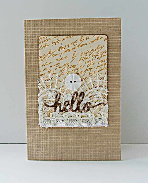
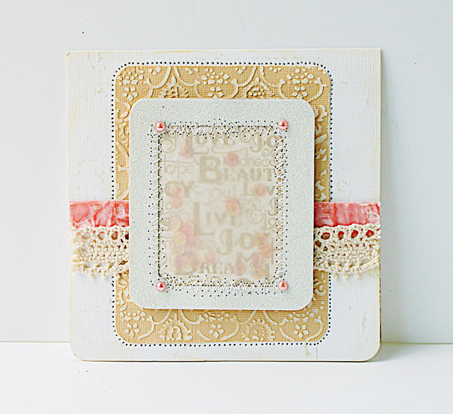
| I love a good cup of tea |
9. Go for shabby chic with a little lace on chipboard action.
 |
| When watercolour met washi |
10. Steal colours from a washi tape design and add textural elements to match.
There you have it. 10 ideas for using pastel colours on your cards. Which is your fave?
P/s: You can see the closeups of each card by clicking on the links to the original posts.