Wednesday

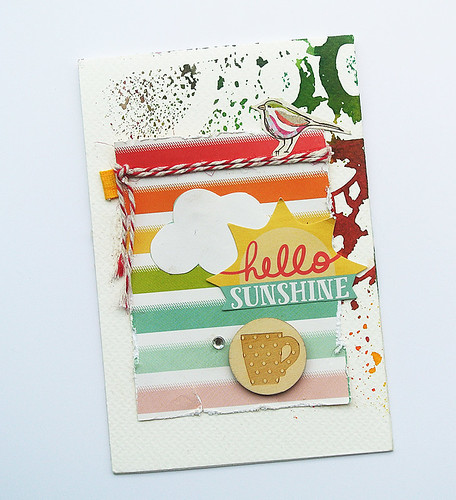
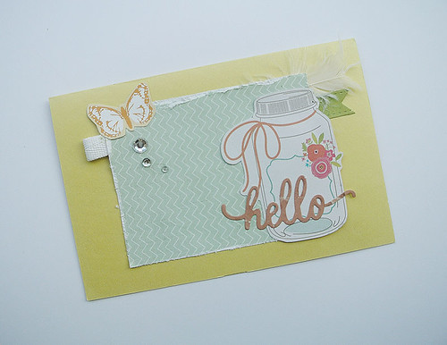
Hello sunshine...card for 2017 Summer Coffee Lovers Blog Hop


Hello-sunshine-Coffee-Lovers-

So I visited an organic coffee farm when I was in Bali two weeks ago. 


It was an interesting experience for a new coffee drinker like me - learning about harvesting the coffee beans, processing, drying and roasting. 


Of course, Indonesia is most famous for Kopi Luwak - coffee that includes partly digested coffee cherries eaten and defecated by the Asian Palm Civet. I saw some of the civets in cages and they looked so sad. Apparently, with the popularity of Kopi Luwak, wild civets are greatly hunted and housed in small cages. Really cruel.


So I'll be sticking to my regular animal cruelty-free coffee.


 Joining in the fun with the 2017 Summer Coffee Lovers Blog Hop.


Share/Bookmark

Pin It

Tuesday

Before and after the playground


Before-and-after

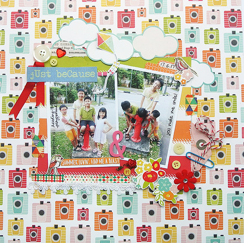
Playing is such hard work...according to The Gangster Gang (aka niece + nephews) and depicted by the before and after photos. *winks*


Before: fresh-faced, happy and not sweaty.
After: Too tired to pose and extremely sweaty. Plus smelly.

*LOL*


Yes, I am now tackling the ribbon stash too....they are like buttons....I never add to them but they never seem to dwindle despite usage. Can anyone relate???


Mixing up the textures here with a felt bloom, a paper bloom, washi tape, lace trim, chipboard, buttons, paper clip and twine.


I like to have a mix of textures on my pages but the elements are relatively flattish.


Slipped in a few of those Basic Grey birds...


Playing along with Stuck?! Sketches.


Share/Bookmark

Pin It

Thursday

Double page spread for Maya Road/Simple Stories swap


Layout-by-Yvonne-Yam-for-Maya-Road-and-Simple-Stories-blog-hop

This week is the Maya Road/Simple Stories swap and there is a chance to win a $20 gift certificate if you leave a comment on any of the posts this week at the Maya Road blog.

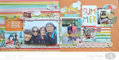
I created a double page spread using the Simple Stories Summer Days collection and Maya Road goodies.


You all know that when I create double page spreads, I like to make them standalone pages in case they ever got separated. ;) But I use similar elements on both pages to ensure cohesiveness.


The spread features a  recent family vacation to Bali, Indonesia. Notice the propped up photo? Well, I had to print that photo 3 times because I kept spilling glue on it....and decided to use them all. 


I was pretty happy with this Simple Stories Summer Days collection because of the bright and happy colours that was just perfect for my vacation photos. :)


And they coordinate really well with Maya Road diecuts and wood embellishments. :) 

In case you were wondering about the photo, I was tea/coffee tasting at the organic coffee farm.


We had to don these sarongs over our clothes (as seen on my mum and sister) before we could enter to visit the Spring Temple.


And my dad got his first pair of Oakley...he was posing in the store! *LOL*


Don't forget to stop by the Maya Road blog to leave a comment for your chance at a $20 gift certificate!


Share/Bookmark

Pin It
Monday

How to incorporate humour in your layouts...9 ideas


So, the underlying theme in my family layouts is always humour. Sometimes in the photos captured, the embellishments used, the stories leading to the layouts...you know, real life. Others may have scrapbook albums that are stunning in the artistry of embellishing, mine just gets people laughing out loud. And that's the way I like it. :) Here are 9 ideas for incorporating humour in your layouts....from the 2013 archives. :)

March2013
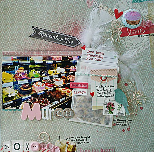
I've been checking you out
1. Reimagine the themed papers.

On this layout, I used Valentine's Day papers to tell the story about the hunt for my birthday cake.

12345678
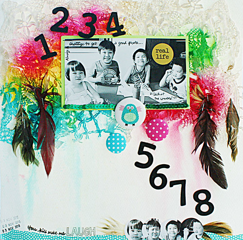
This is real life
2. Just use the real-life photos.

Kids will never tire of making silly faces at the camera so instead of tearing your hair out trying to get them to cooperate for a nice fake photo, why not just use the ones that reflect real life? *winks*

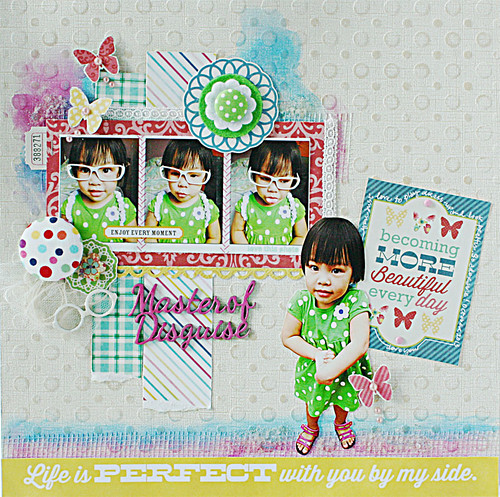
Master-of-disguise
Meet the master of disguise

3. Capture the micro-expressions.

You never know what you can capture when you catch the young ones at play.


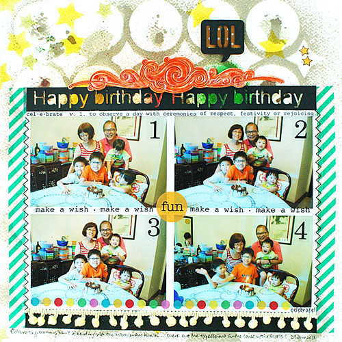
Happy birthday layout
How to create a fun mixed media layout with your birthday photos

4. Use consecutive photos to tell the story.

So it was hard to get everyone to cooperate here...*LOL*

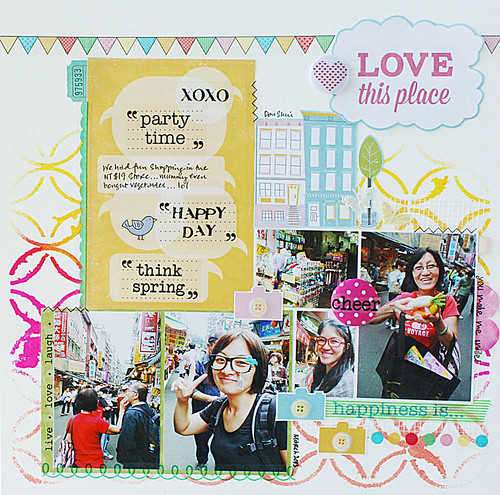
SRM-stickers-love-this-place-layout
The NT$19 store
5. Capture shopping moments.

Especially when you try out stuff you probably would buy but will have a good laugh at the store. ;)

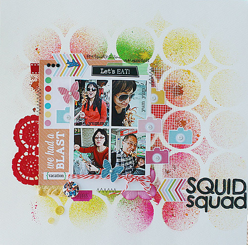
Squid-squad
The Squid Squad
6. Food-eating moments.

Incorporate fun food-eating highlights like this one of all of us eating squid. Note the title.

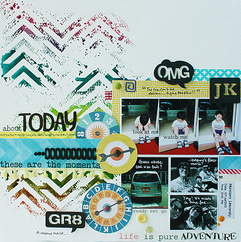
About-today
The story about the day we went to watch Monsters University

7. A re-enactment is totally okay.

So this was the day we were supposed to go see a movie and when it was time to go, the car wouldn't start and it was parked in front of the other available car. Then the tow truck came and saved the day. The photos of the nephew looking sad were re-enacted after we came back from the movies. ⇩

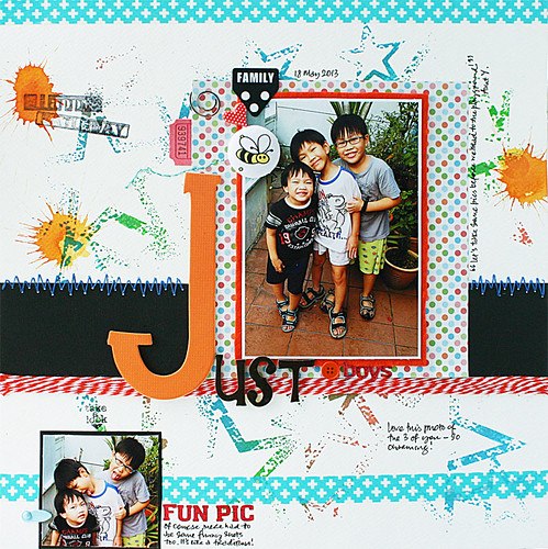
Just-boys
Finally...a decent photo of the nephews

8. Include the outtakes.

The outtakes are the best!

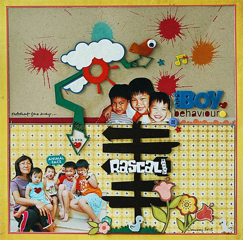
100%-boy-behaviour
Photoshoot gone awry
9. Create a fun "scene".

Well, it doesn't even have to make sense...just throw in some birds and flowers and cute kids!


There you have it...9 ways to incorporate humour in your layouts. What about you? Do you incorporate humour in your layouts?


Share/Bookmark

Pin It

Thursday

A paper and glue card


A-paper-and-glue-card

I'm currently enjoying the process of using just paper and glue [okay, with a little bling! *winks*] on my projects in my attempt to use up my paper scraps. Even though I LOVE mixed media, it is refreshing not to have a mess to clean up after. :)


Plus it's always interesting to dig through my paper scraps for cute elements to use.


Playing along with Match the Sketch.


Share/Bookmark

Pin It

Wednesday

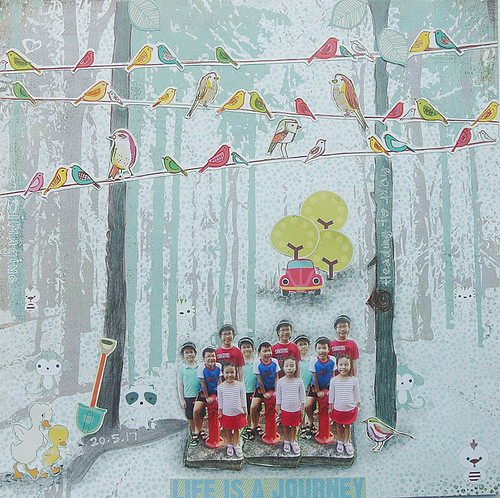
Posing at the fire hydrant...


Posing-at-the-fire-hydrant

There's this fire hydrant that we pass by en route to the playground that I like to get the Gangster Gang (aka nephews + niece) to pose at. :)


The trick is to get them to give me a few good shots before they can go to the playground - that's when they really "cooperate" because the reward [= playground] is in clear sight. *winks*


Here, I managed to incorporate some of those Basic Grey birds with some Echo Park Paper ones - I don't know why I have so many birdies in my stash!*LOL*


The photos were fussy-cut and I used a graphite pencil to create a shadow for depth (cause I ran out of 3D foam!). I also doodled on the tree for a fun touch.


I also threw in a spade, ducks, car and trees to complete my whimsical scene.


P/s: Been travelling for the last 2 weeks...will play catch-up on blog commenting this week. :)


Share/Bookmark

Pin It

Tuesday

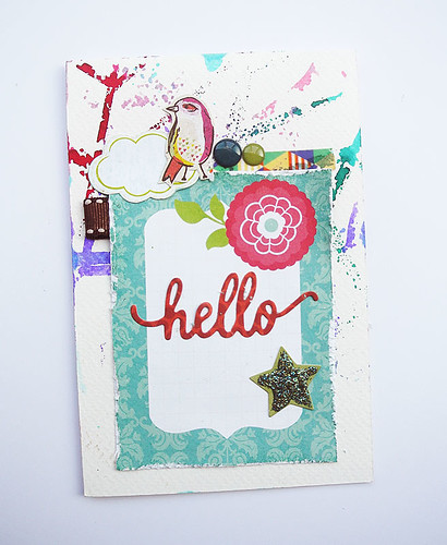
This week's mish mash card


This-week's-mish-mash-card

Hello friends...yes, that's another Basic Grey bird you see on this week's mish mash card. *LOL* 


I have certainly gotten a lot of mileage from a single sheet of 12x12 patterned paper...[Are you sick of them yet? *winks*]


Threw in a few enamel stickers...


And added a little "bling" with Ranger Stickles...


The card base is residual-misted watercolour paper.


Share/Bookmark

Pin It
>
Related Posts Plugin for WordPress, Blogger...

LinkWithin

Pin It