Thursday

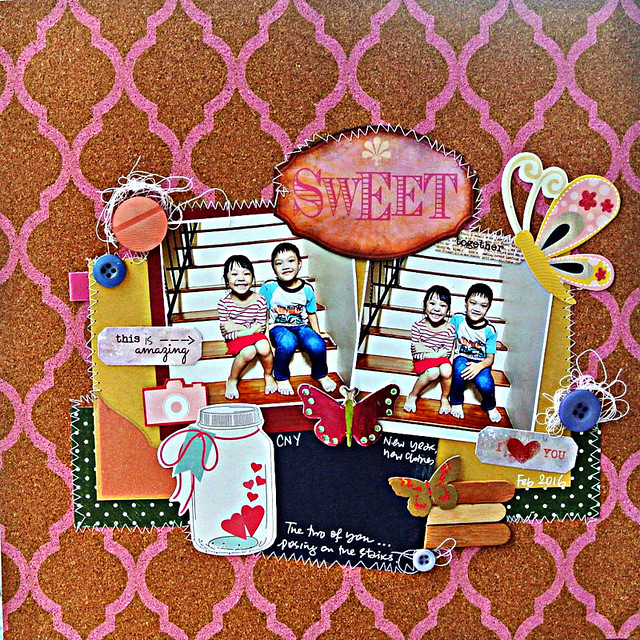
These two are so sweet together...:)


Sweet-together

So the other day, I discovered the best spot for photo-taking at home. The staircase! There's a window on the opposite wall that lets in light. :)

Of course,  the discovery only came after 8 years living here...*slaps forehead for stupidity*


Determined not to waste any more glorious photo possibilities, I had to take photos of littlest nephew and niece...these two are so sweet together. :)


I decided not to hoard this DCWV cork paper...and added random bits of fussy-cut patterned papers.


Playing along with Stuck?! Sketches.


Share/Bookmark

Pin It
Wednesday

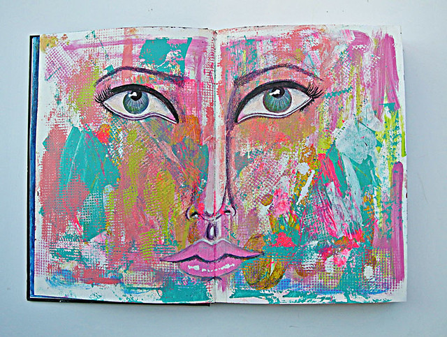
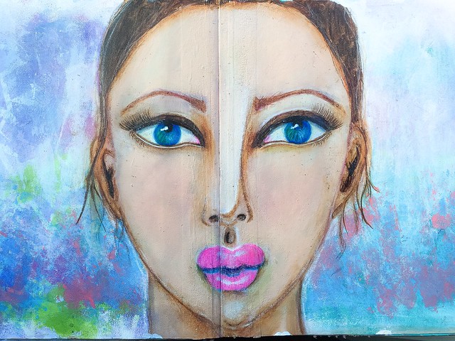
The abstract that went awry....*winks*


Face-on-a-messy-background

Well friends, you know I've been a little obsessed with faces in the last few months. The other night, I really meant to work on an abstract spread in my art journal *pinky swear*...


But you know, abstracts are hard....they need a focal point. So I drew an eye. Since I like symmetry, the only logical thing to do was to draw the other eye, right? *winks*


After that, the nose and lips just had to be drawn of course. *LOL*


So here it is, the abstract that went awry. *cheeky grin* 

Do you think she needs like a clearly defined chin and face?


Share/Bookmark

Pin It
Monday

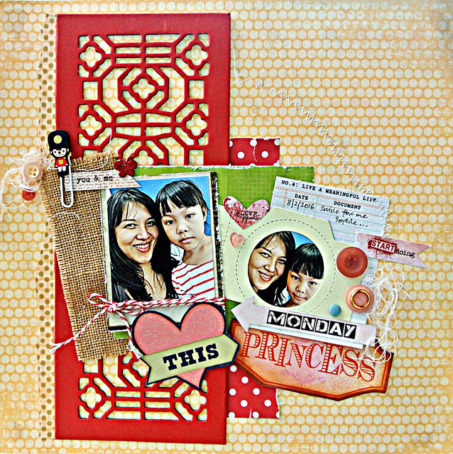
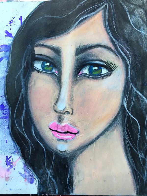
The one where the "princess" refused to smile...*winks*


Love-this-princess

My niece S is one of those kids that takes time to warm up to you...and this was one of those days when the princess refused to smile for the camera even though she followed me to my room and wanted to "hang out"....


By "hanging out", I mean she wanted to try on my accessories and check herself out in the mirror! 
*LOL* 


I wonder where she got that vanity gene from? *winks*


I got a teeny weeny smile here....:)


Playing along with Stuck?! Sketches.


Share/Bookmark

Pin It
Friday

1 stencil, 8 ways


Friends, you know how much I love my stencils. I reach for them and some colorants when I need to quickly do up a background or to add a little bit of texture to help me finish up my projects. Here is one of my fave 6x6 stencil from The Crafter's Workshop used in 8 different ways.

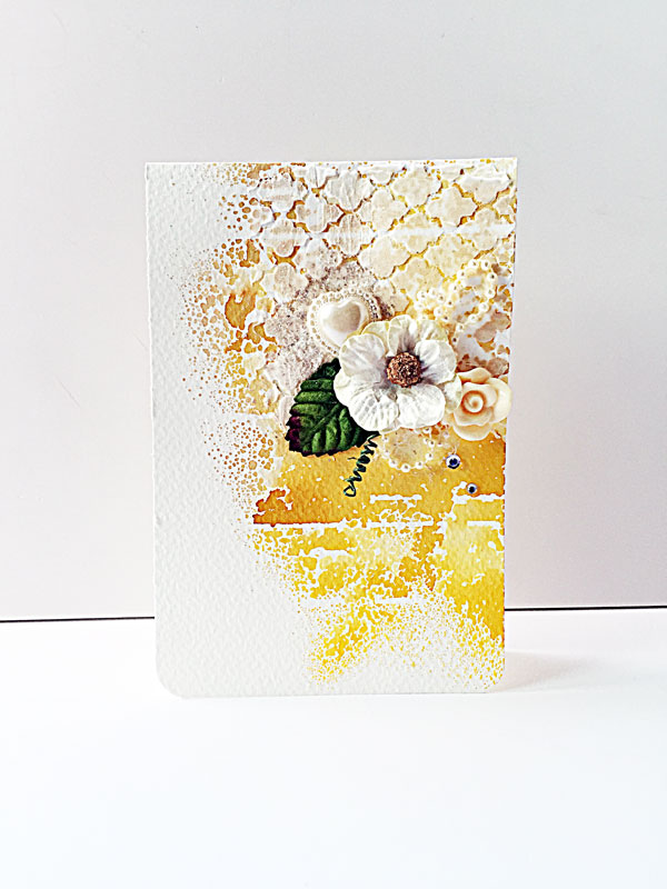
Neutral-mixed-media-card
Making a statement out of neutrals

1. Tone down a bright background.

The background that was created with residual mist and another stencil was a little "loud" so I applied a very thin layer of light modeling paste with the stencil. You can still see a bit of the colour peeking through paste but the paste helped to tone down the background and formed the perfect backdrop for my focal point.


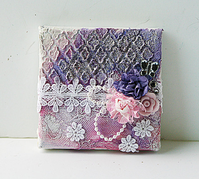
2. A "catchment" area for mica flakes.

I really wanted the mica flakes to sparkle here so I used my stencil with a thick layer of light modeling paste, sprayed some purple mist, applied some gel medium and sprinkled the mica flakes on top for dimensional sparkle.

Mixed-media-canvas-by-Yvonne-Yam-for-ColourArte
Mixed media canvas for ColourArte

3. Cover up a "patchy" background.

The base layer was covered with remnant bits of tulle and lace that turned out "patchy" so I applied a thin layer of light modeling paste with the stencil to tie everything together.


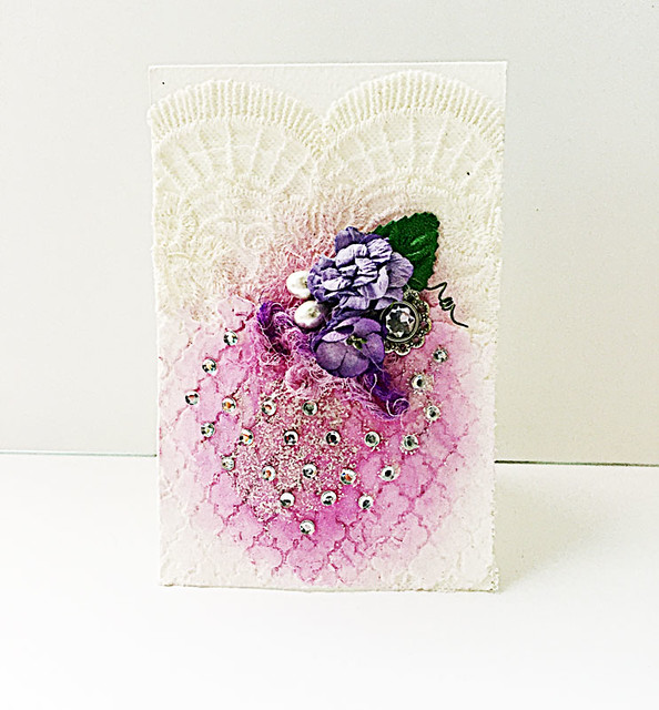
For-the-love-of-purple
For the love of purple

4. Serve as a grid.

Here I used the defined edges of the stencil design as a grid to stick my bling on.

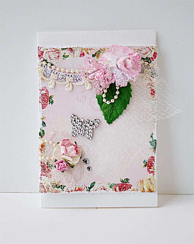
Vintage-inspired-mixed-media-canvas
How to create a vintage-inspired mixed media canvas

5. Break up a pattern.

The vintage patterned paper I used for the background didn't help to guide the eye to the focal point so I broke up the pattern with the stencil + light modeling paste + Silks Acrylic Glazes.

Pink-mixed-media-card-by-Yvonne-Yam-for-The-Crafter's-Workshop
Can I stick to supplies I pulled out?

6. Add subtle texture to the background.

Here I used the stencil with some watered-down gesso for a subtle pattern on the patterned paper.

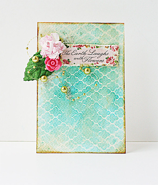
7. Create a "water-coloured" background.

A light mist and some water on a stencil and you can get the look of a water-coloured background.

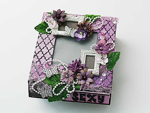
Mixed-media-box
Purple mixed media box for Made with Love

8. Add a decorative border to a box.

Instead of using patterned paper to decorate the base of my box, I used the stencil with light modeling paste and mist to add a decorative border around my box.

There you have it, 1 stencil, 8 ways. Do you have a fave?


Share/Bookmark

Pin It
Tuesday

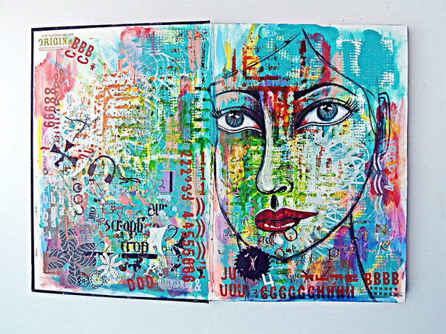
Paint + mists + gesso = hope for the best.... *winks*


Blend-in...

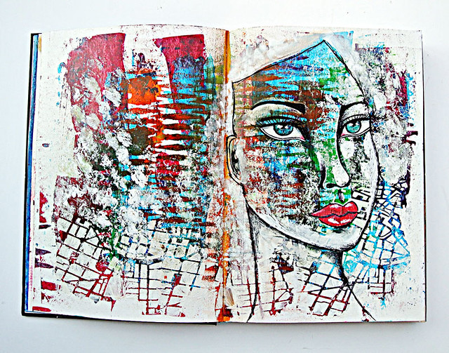
This was one of those art journal pages where I really "threw" paint + mists + gesso = hope for the best. *winks*


I started by spreading paint with an old credit card. When that dried, I went in with a stencil and mists. Next, I added a layer of super heavy gesso with another stencil for texture, The round white spots were added when I decided to clean my gesso-covered fingers on my pages. *LOL*


Of course, after all the paint-throwing, my journal pages were lacking a focal point. Given my recent obsession with faces, you know I just had to add one in right? I boldly went in with a black acrylic paint marker and then added highlights with a white acrylic paint marker.


I love that she blends in with the background and her features still stand out. What do you think?


Playing along with ARTastic Challenge.


Share/Bookmark

Pin It

Monday

A double-pager!


Thailand1

It must have been ages since I did a double-pager! But after printing out the photos, it was clear that they weren't going to fit on a single page....I even had to cut some silhouette photos to fit everything in, leave some white space and allow for some embellishments. *winks*

I am still diligently working through my patterned paper stash...while trying to finish using my bottles of Ranger Stickles.  


The gold foil bits, the Stickled chipboard title work and the sequins plus bling made this a rather sparkly layout [it was hard to photograph it though].


In case you were wondering, my parents and sister had a wonderful 3-day getaway to Thailand a few weeks ago...:)


Playing along with More Than Words challenge.

Share/Bookmark

Pin It

Friday

Drawing progress...:)


Mixed media girl in art journal1

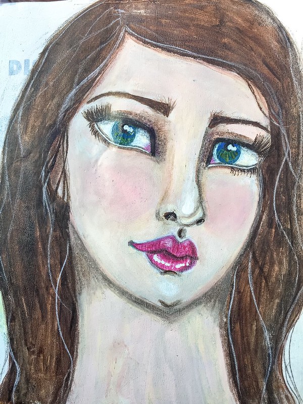
So friends, I've finally completed a whole art journal of drawn and painted faces! It only took like 6 months! *LOL*. 

I like having a completed art journal of faces to track my drawing progress. Some of them I've already shared earlier but here are a few more...:)


Mixed media girl in art journal2

Yes, I've been told that my girls look kind of sad. I think it's because I keep giving them "nip tucks" to improve their looks! *winks* 

Mixed media girl in art journal3

And my girls wear falsies. For now. Real eyelashes are hard....*winks*

Happy weekend friends! :)


Share/Bookmark

Pin It

Tuesday

The one where I went crazy with the rub-ons...*winks*


The-one-where-I-went-crazy-with-the-rub-ons

You know that one craft supply that drives you crazy because it is hard to store and doesn't "perform" well 100% of the time? Well, mine would be rub-ons. 

And the other day I went crazy with them on an art journal page....*winks*


Yep. Lots of "parts" and "bits" because rub-ons don't keep well in my climate. But fortunately I don't have a lot of rub-ons...this is about 1/3 of my rub-on stash. 


And of course, since I'm obsessed with drawing faces, I just had to add one in. I kind of like this "loud" page. What do you think?

Playing along with Creative Artiste Challenge Blog.

Share/Bookmark

Pin It

Thursday

I love a neutral palette...


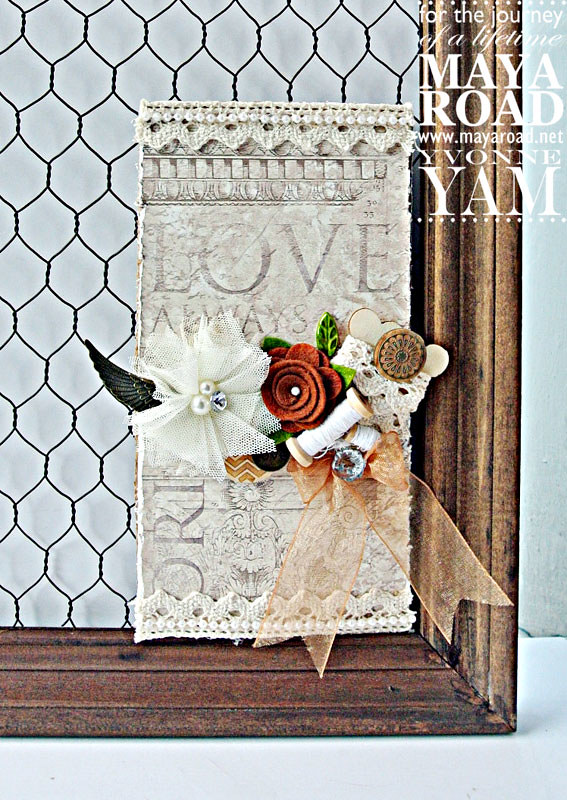
Neutrals-on-a-tag-by-Yvonne-Yam-for-Maya-Road

Even though I enjoy bold uses of colour, sometimes I do love a neutral palette. 


I love how you can play with the different textures within the neutral palette to create interest.


Can you spot all the different textural elements I used here? 


A mix of soft elements with the tulle, felt, thread and trim, and a mix of the hard elements with the wood, plastic and metal pieces.


A cardboard tag created for and with Maya Road embellishments.


Share/Bookmark

Pin It
>
Related Posts Plugin for WordPress, Blogger...

LinkWithin

Pin It