Friday

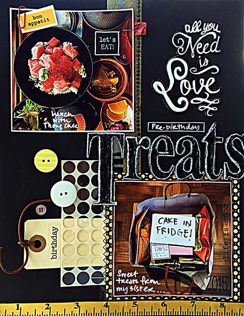
When Murphy's Law came into play....


When-Murphy's-Law-came-into-play

Murphy's Law: Anything that can go wrong, will go wrong.
So this was one of those projects where Murphy's Law came into play. Like seriously. *winks*


Can you believe I spent an hour on the title chipboard pieces?

I really wanted them to be gold. But I couldn't find my gold Sharpie. Then I remembered that I gave it to my cousin. 

So I went in with my black Sharpie. Of course, the black on black wasn't really working so I went in with some crackle accents. However, that took forever to dry and of course, I had to test it with my finger....and kind of had to do it for all the letters to "save" them. The letters were still not standing out on the layout so I went in with my trusty white gel pen. 

But the gel pen just didn't take to the glossy uneven surface so when I was done all the letters, the white ink did a disappearing act and I had to go over everything with a white paint pen.

Well, I was pretty tired after the "drama" with the titlework so everything else was kept simple. *LOL*

Playing along with My Creative Sketches.

*Edited* This layout was featured on My Creative Sketches.

Share/Bookmark

Pin It

Wednesday

Come join me in my magical tea party...


Magical-tea-party-mixed-media-canvas-by-Yvonne-Yam-for-ColourArte

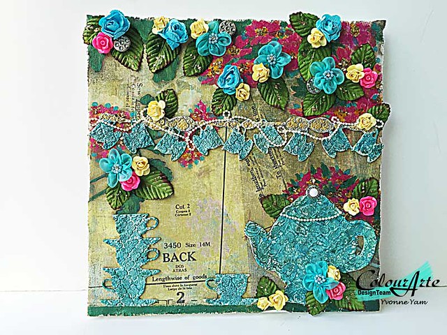
Hello friends! Today I'm sharing my magical tea party mixed media canvas over at the ColourArte blog. :)


I saw these teacups and teapot chipboard pieces from Gina's Designs and thought..."Hmmm....time for a tea party!" If you would like to see how I created this canvas, head over to the ColourArte blog where I share a step-by-step tutorial using my fave Silks acrylic glazes. :)
Share/Bookmark

Pin It

Monday

How my scrapbooking style works for me...


Mother's-Day

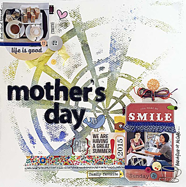
My style is quirky at best....but really comes from my need to use up the little bits of scrap lying around that are driving me crazy! And yes, when you see me using a similar embellishment on multiple layouts, it usually means I'm trying to use them all up too. *winks*


I stick down little bits of remnant trim and ribbon, tags and stickers here and there....make sure it's visually balanced and I'm done. There are times after I've photographed the layout when I think the layout can be improved but I usually leave it as it is [*ahem..lazy bones*]. 
Playing along with Sketchabilities.

Share/Bookmark

Pin It

Friday

Instalove card...

Instalove-card

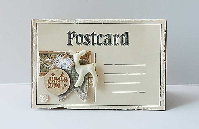
Even though I love bold colours, I tend to get embellishments that are neutral...so that I get to jazz them up myself with mediums and colorants.:)


But sometimes I love to leave them as they are....for the raw organic feel. Love these embellishments from Maya Road. :)

P/s: Happy weekend friends! :)


Share/Bookmark

Pin It

Wednesday

The case for the "no sentiment" card....


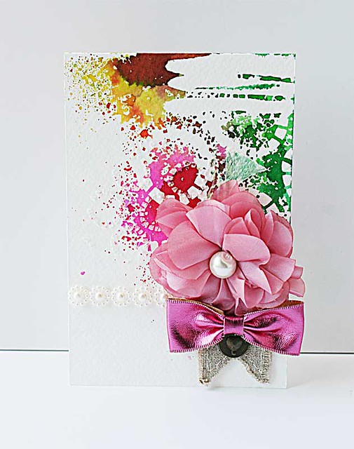
Pink-bow-mixed-medid-card-for-Maya-Road

I have a HUGE box of handmade cards but NO card to use when I actually need to send a card out to a friend. Now that is a serious problem.

Because the whole point of making cards is to give them away right? *winks*


Well, that's my story for the "no sentiment" card and I'm sticking to it! [I tend to "ruin" my cards when I try to stamp sentiments on them...that's why I always use stickers...*LOL*]

P/s: Hope your week has been lovely so far...this card was created for Maya Road for a craft show.


Share/Bookmark

Pin It

Tuesday

The "over-embellished" layout....*winks*


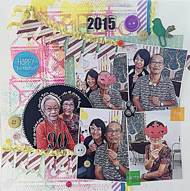
90

 I don't really start my layouts from "scratch". I usually have a residual-misted cardstock base that I "decide" that I have to use...and then work from there....


Now that would be easy if I kept my photos in black and white or sepia. But my mum always "complains" when photos are not in colour [so I only make them b/w if the photo quality is really terrible]. 


And I also have a tendency to glue things down once I find a place for them [to reduce the fiddling time]. 


Then of course, add more embellishments to correct my "mistakes"....hence this "over-embellished" layout. *winks*

Playing along with Stuck?! Challenges.

P/s: Photos were taken at my grand-aunt's 90th birthday celebration...where my sister and dad had fun playing "dress-up"! :)


Share/Bookmark

Pin It

Monday

The one where the scoring board came into play....


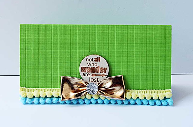
Not-all-who-wander-are-lost-card

I recently went on a "get my stuff out of boxes and use them more often" rampage. Now, I do use all of my supplies albeit rarely if they have to be taken out of packaging in order to use them *lazy bones*. Of course, one of these items is my scoring board.


So I just had to celebrate by scoring my card base right? Now my scoring board is no longer "wandering"...*winks*


Share/Bookmark

Pin It

Friday

Your weekend project: cupcake trinket pin holder


Let's-have-a-cupcake

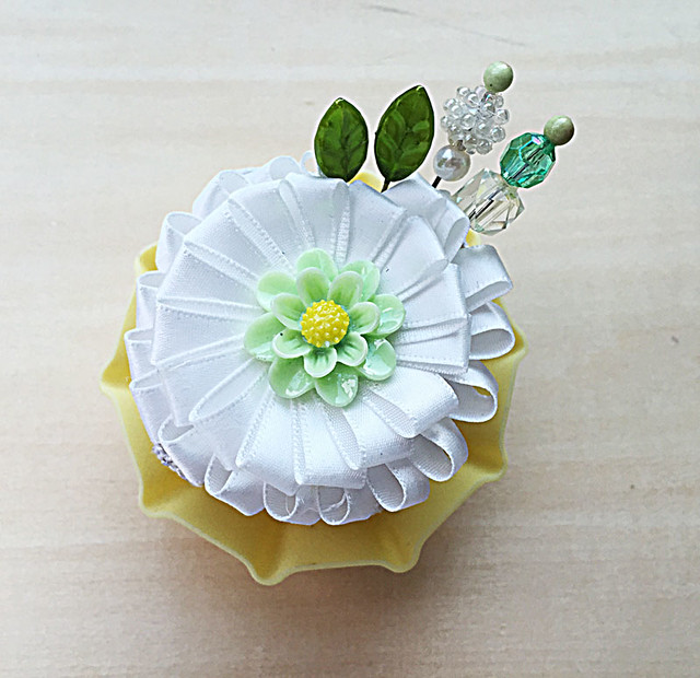
Want to make quick and pretty project this weekend? How about a yummy cupcake that holds your pretty trinket pins? Read on for easy instructions!


Get a sturdy sponge or foam [I "stole" my mum's cleaning sponge. *winks*] and a cupcake liner. I used a silicone one.


Gather you pretty things and a hot glue gun. I used pearls for the "sides" of my cupcake, added remnant lace trim to make it pretty. Then finished it off with a ribbon bloom. The leaf trinket pins are from Maya Road. The other two trinket pins were made with long pins, beads and glossy accents.


Put your finished "cupcake" in the liner and you're all done! No baking required! *LOL*

If you have time, consider playing along with LESSology Challenge #47: Let's have a cupcake!.
Happy weekend my friends! Thank you so much for stopping by my blog this week!


Share/Bookmark

Pin It

Wednesday

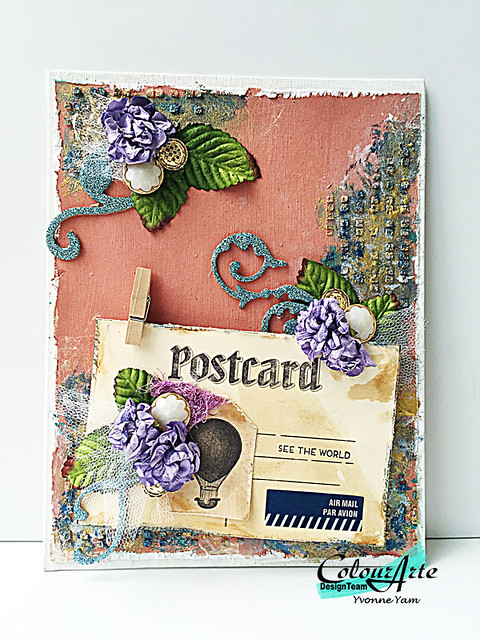
See The World mixed media canvas for ColourArte


See-the-world-mixed-media-canvas-by-Yvonne-Yam-for-ColourArte

I have a thing for travel paraphernalia...especially vintage-inspired ones. I have lots of travel stamps [that I hoard..*winks*], vintage-inspired postcards and map paper....I just cannot pass up on map paper. *LOL* 

So it is no surprise that I made a mixed media canvas that celebrates my love of vintage travel paraphernalia right? [minus the map paper of course...that goes into the hoarding box!] :)

If you would like to see a step-by-step tutorial of how I created this See The World mixed media canvas, please head over to the ColourArte blog


Share/Bookmark

Pin It

Monday

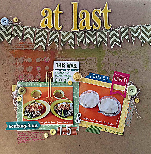
At last....


At-last

So there's always this super long queue at this stall selling vegetarian noodles at the hawker centre we frequent. Now I absolutely hate queuing for anything but I've been dying to try out the noodles for months.


At last....my patience paid off...we arrived early enough with only about 6 people in the queue!


Oh well, the dish didn't exactly blow my mind but since I don't think I'll be queuing for it again, I thought it needed to be scrapbooked....*winks*


Playing along with Kraft Plus Challenges.


Share/Bookmark

Pin It

Thursday

How an abandoned canvas finally saw the light of day....


Mixed-media-noticeboard-by-Yvonne-Yam-for-Maya-Road

This was one of those projects that I had in my half-done pile. The 12 x12 canvas base was covered with remnant gauze pieces of various sizes and chipboard pieces that have fallen off their adhesive backings ...and were basically driving me nuts. Yet, after sticking them all down with gel medium and putting a layer of gesso over it, I wasn't really feeling it....so it went into cold storage. [Okay on a stool in my room but when I turned on the air-conditioning...it went into "cold storage"...*LOL*]


Then my box of new stencils from The Crafter's Workshop arrived. And I fell hard for this post card stencil. And had to use it immediately. And then everything just fell into place....


Now I have a mixed media canvas noticeboard to temporarily house unscrapbooked photos....and that is how an abandoned canvas finally saw the light of day...:)

This project was first shared on the Maya Road blog.


Share/Bookmark

Pin It

Wednesday

Understated neutrals: 10 ways to use them


Neutrals are often associated with being "safe" and "boring". But I love how they can create an impact without being too loud. Here are 10 ways to use them on your projects. :)

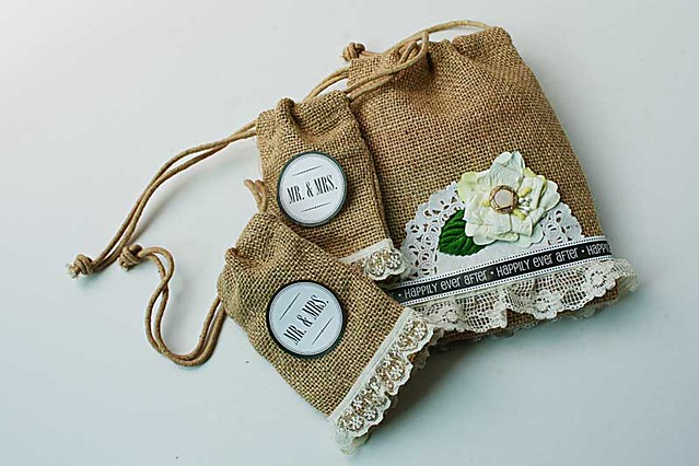
Mr&Mrs-burlap-bags
Quick and easy burlap bags
1. Mix your textures.

Play up the contrast of textures like I did here with the rough burlap against the soft feminine lace and pretty bloom.


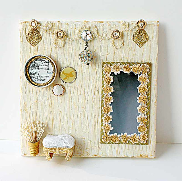
Travel-canvas
My first love is altered art

2. Try a little gold and bling.

Mix different shades and textures of gold on your elements to create interest but maintain colour harmony. And bling makes everything better. :)


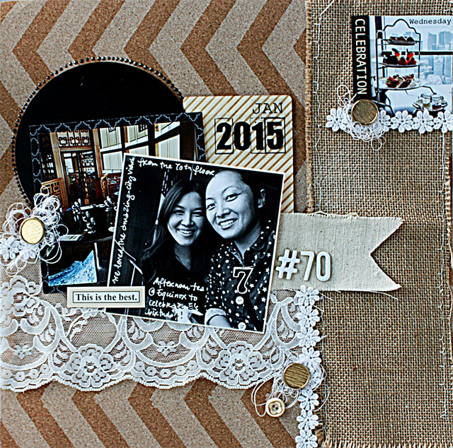
Afternoon-tea
Afternoon tea
3. Add black.

The contrast of black against the browns, beiges and whites really draws your eye to the focal point.

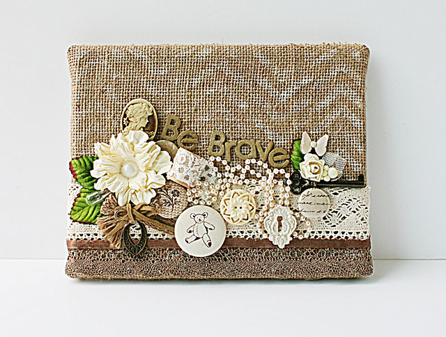
Be-brave-mixed-media-canvas
When elements appear to be unrelated
4. Add interesting elements in similar tones.

Take out all your neutral toned embellishments and put them in a pleasing cluster.

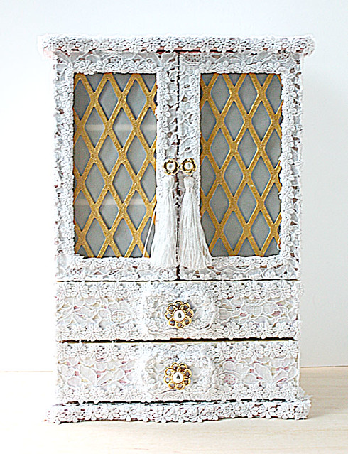
White lace makes everything pretty. Nothing more to say...*winks*

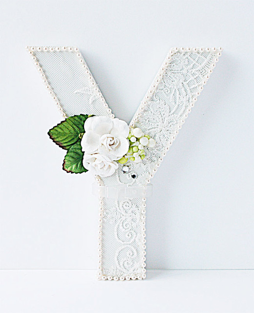
Y-white-decorated-monogram
The embellished white wood monogram
6. Make something classy and timeless.

See 5. 

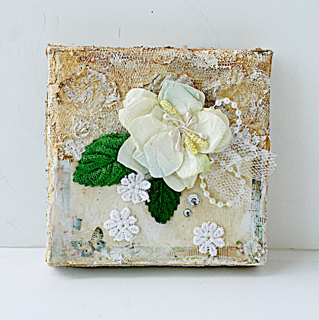
The top portion of the canvas was a mish mash of leftover white lace which were coloured with a gold Faber Castell Gelato. I then dab white gesso to bring out the lace details. The patterned paper was toned down with watered-down gesso so as now to compete with the blooms.

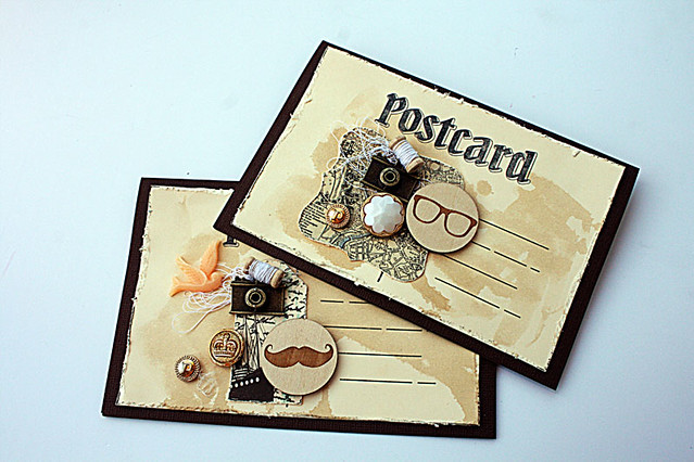
An-invitation-to....
Handmade invitations
8. Go for a fun vintage vibe.

A little distressing on the edges, random splashes of tea stain and a cluster of vintage-inspired embellishments and these cards scream fun!:)

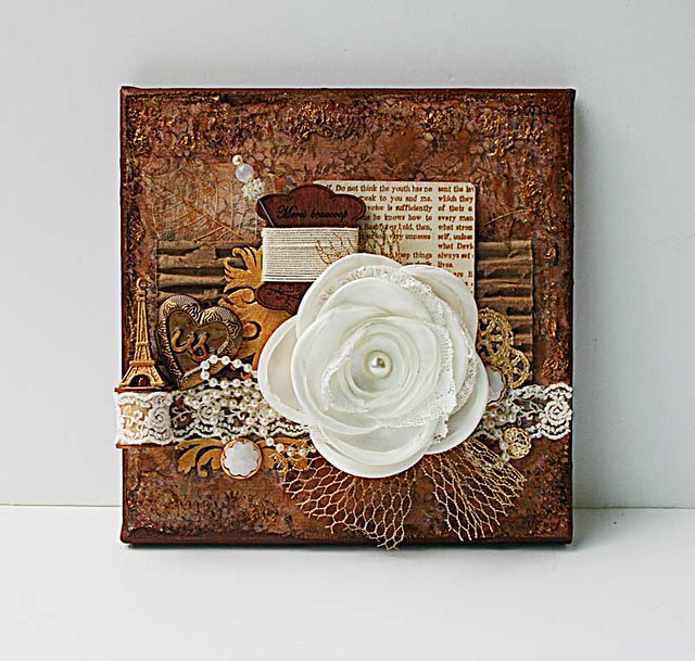
French-inspired-mixed-media-canvas
Will you be nicer to me Paris?
9.  Give the brown, white and gold combo a go.

Mix up the textures for an old world charm feel.

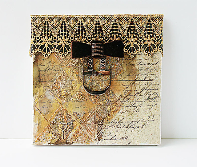
Vintage-inspired mixed media canvas
What do you collect?
10. Glam it up!

Play with gold and silver on walnut-ink stained vintage paper. Add a velvet bow and glam hardware for vintage glam! :)

There you have it. 10 ways to play with understated neutrals. Do you have a fave?


Share/Bookmark

Pin It
>
Related Posts Plugin for WordPress, Blogger...

LinkWithin

Pin It