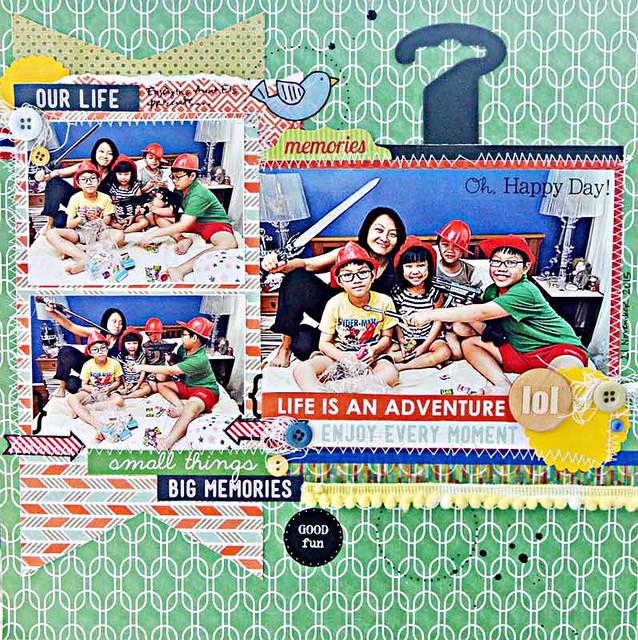
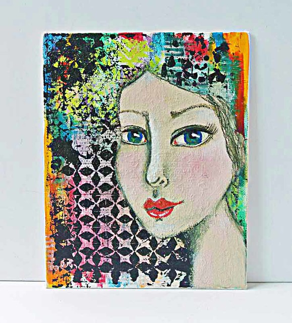
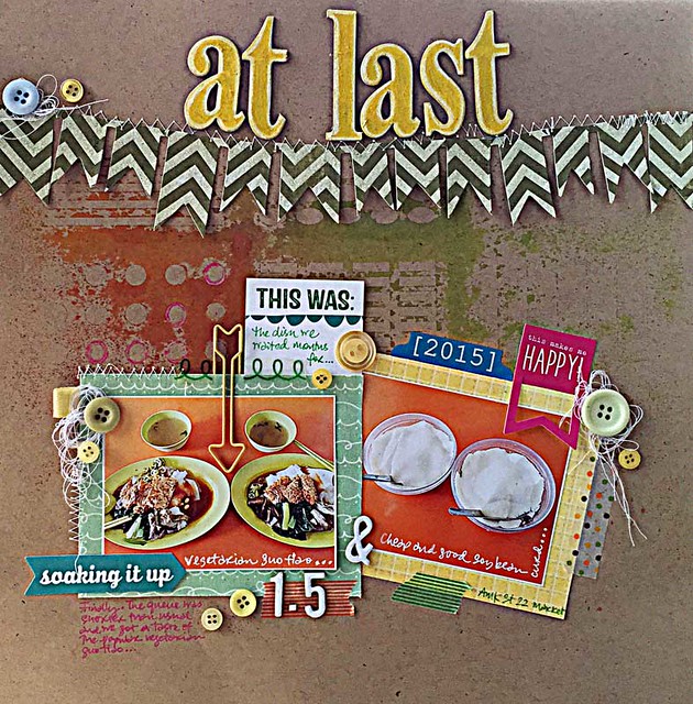
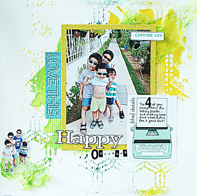
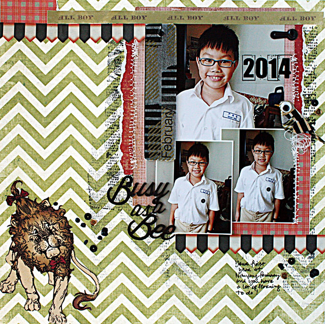
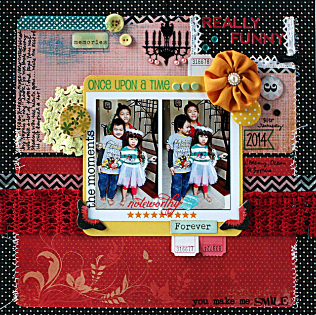
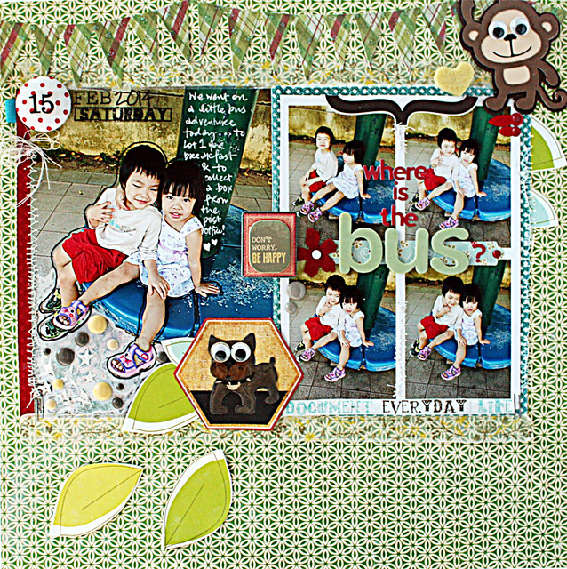
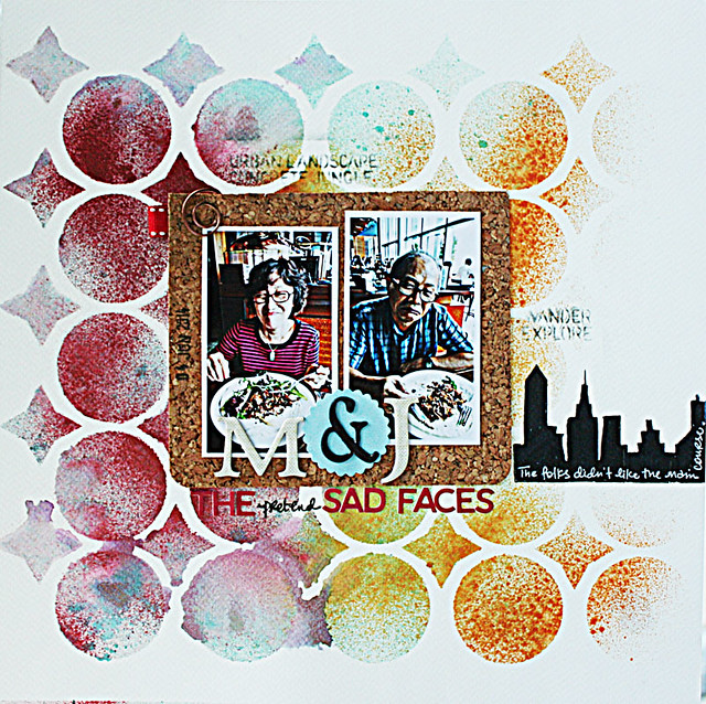
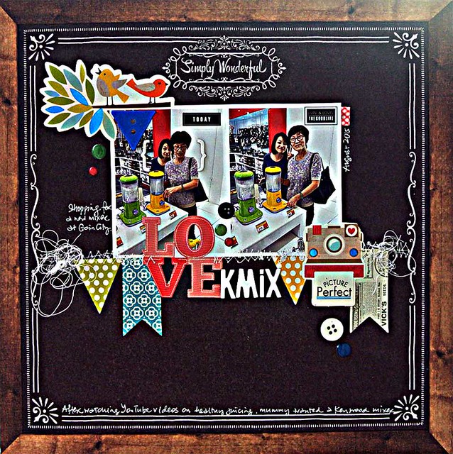
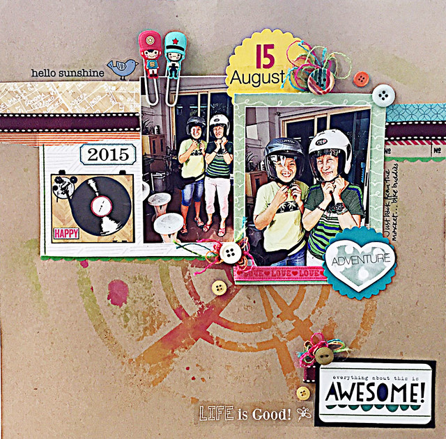
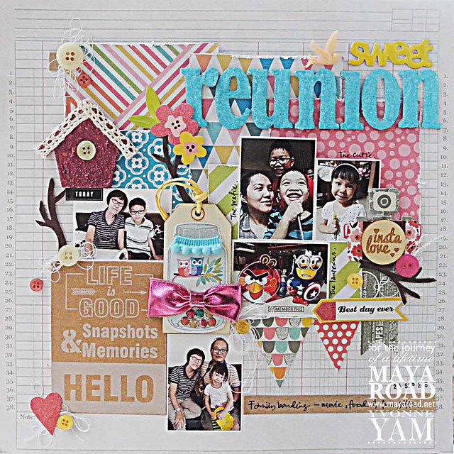
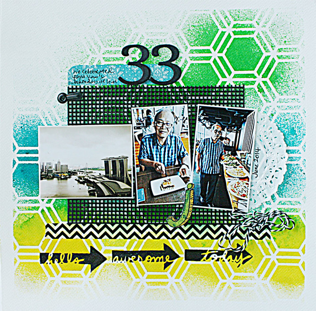
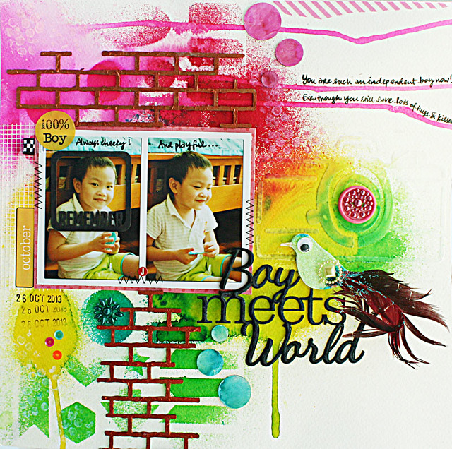
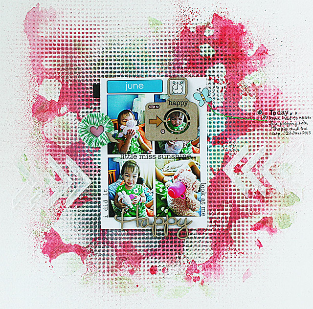
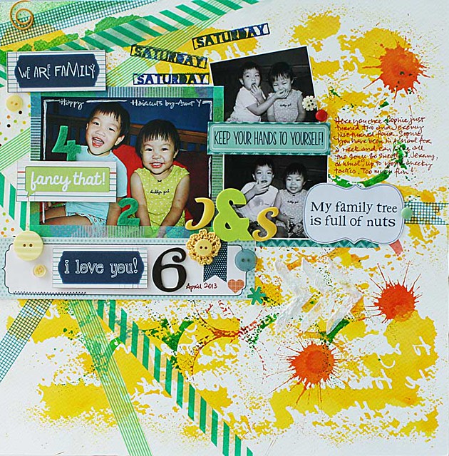
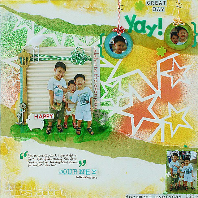
Colours help to convey emotions and that's why my family layouts are often in bright and bold colours. It always makes me happy when I flip through my albums. Are you shy about using bright and bold colours on your pages? Here are 10 ideas for creating bright and bold backgrounds for your layouts.
1. Go with bold colours in a graphic pattern.
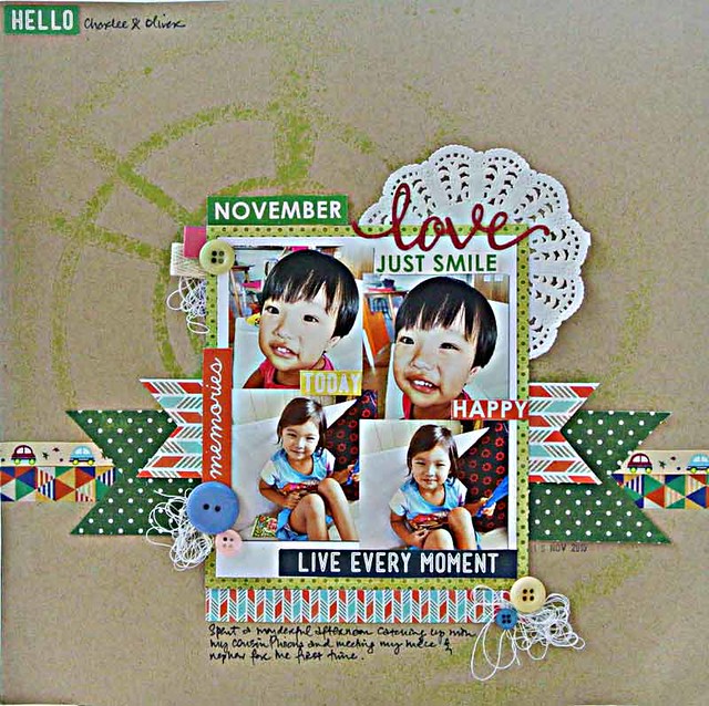
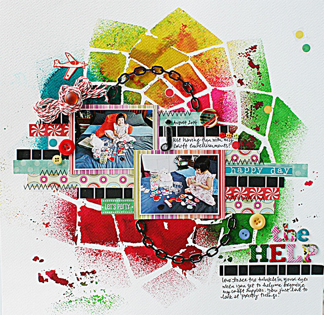
Strips of paper scraps helped to anchor the photos and smaller circular elements (buttons and brads) helped to tie the elements together.
2. Create a "faux" grid.
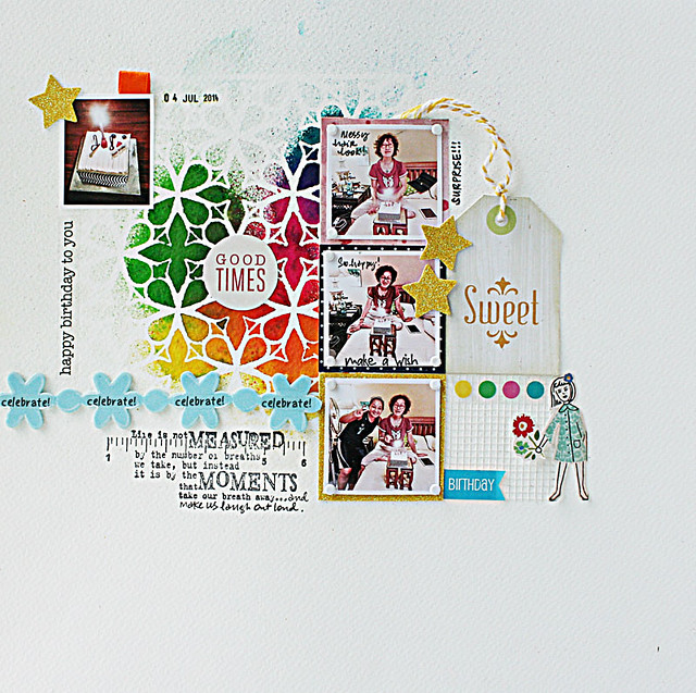
A grid makes it easy for you to place your elements. Repeated elements like the floral design complete the visual triangle (the misted background, the strip of foam blooms and the girl holding a bloom) and pull the composition together.
3. Extend the colours from your photos.
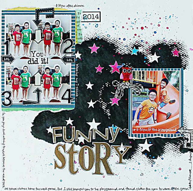
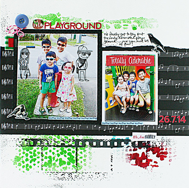
Tie the elements together by using a strong grounding colour like black. Black and white is an optically arresting combination with powerful graphic qualities.
4. Try some drips.
Here the drips from the Dylusions mists helped to guide the eye both horizontally and vertically. Try tilting the paper or blow using a straw.
5. Help guide the eye with obvious cues.
The repeated elements here create harmony even though the background is a little messy.
6. Play with diagonals.
Diagonals can add movement and help to guide the eye across your layout. The washi tape, stamped words and tilted photo helped to tie the elements together even though the background is a little noisy.
7. Create a "scene".
Make the bold background the backdrop of your fun "scene".
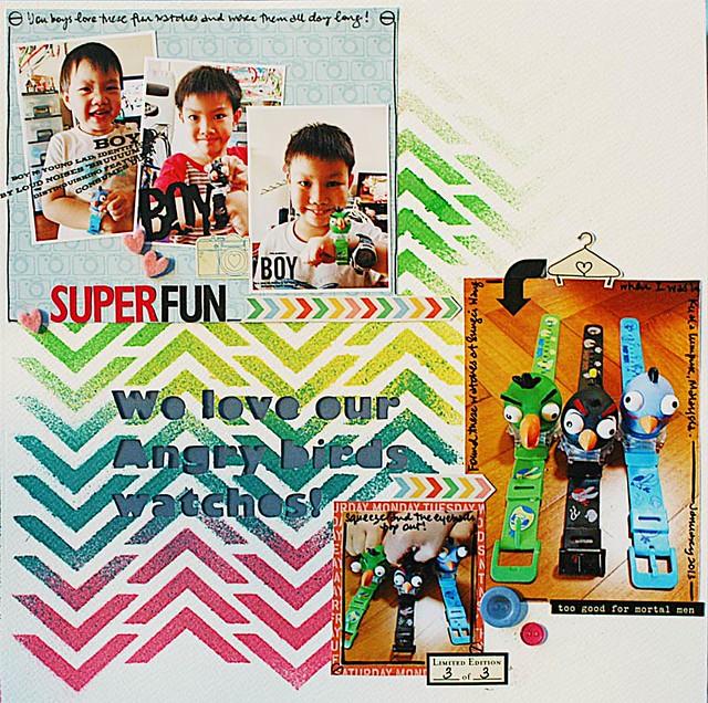
8. Play with a chevron design.
One powerful design element combined with the power of "threes" (three boys, three watches, three photo blocks) pull the elements together on a relatively simple layout.
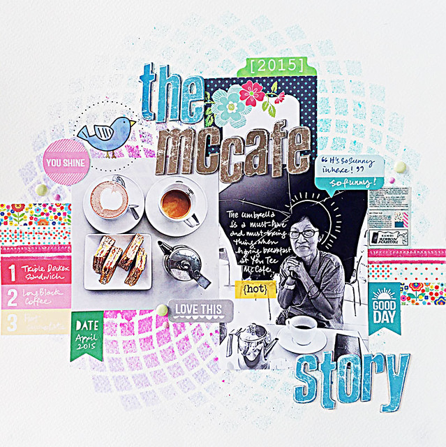
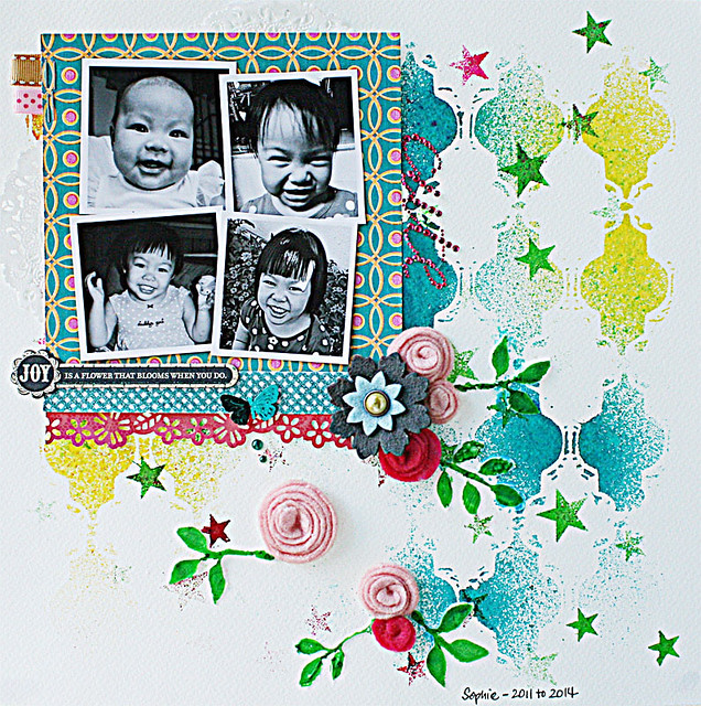
9. Go with black and white photos.
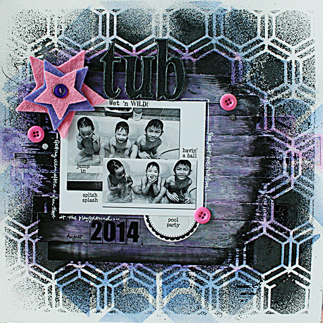
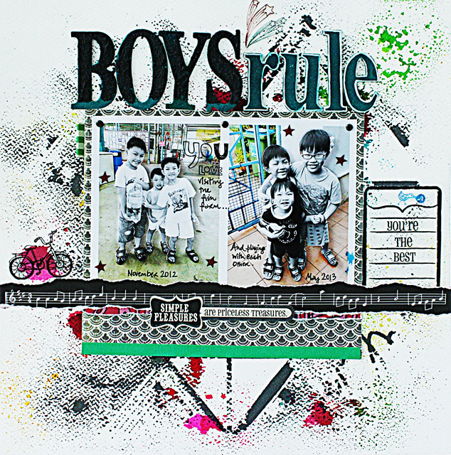
The contrast of black and white photos against a bold background always create a visual impact.
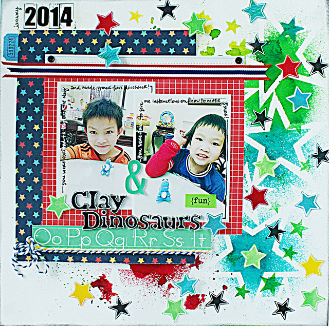
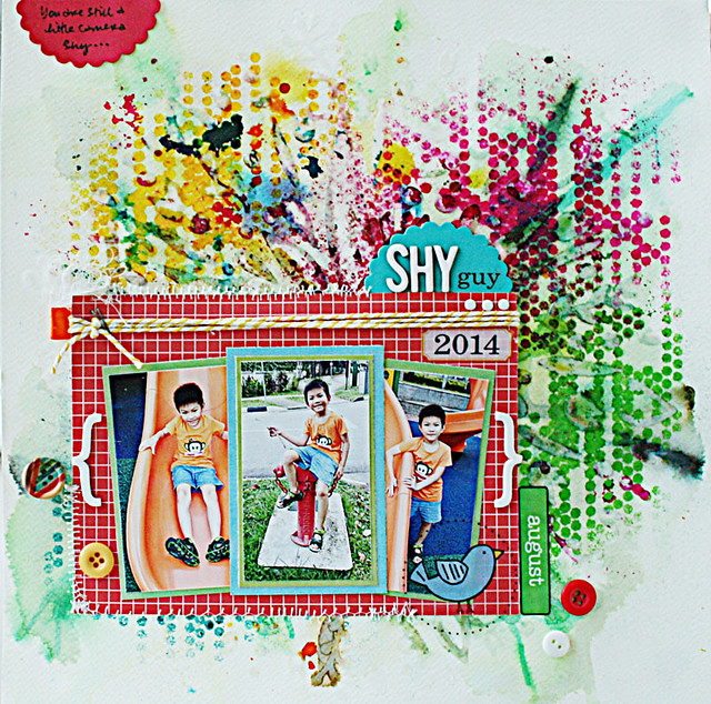
10. Go wild with layering stencil designs with different mediums.
Have a little fun creating your own custom patterned paper. A starburst stencil was first applied with some gloss gel, then coloured with Ecolines (liquid water colours). Next, Dylusions inks sprays were applied with another stencil to create an artsy messy background. The rectangular photo mat helped to anchor the focal point and serve as a dramatic contrast to the background.
There you have it. 10 ideas for creating bright and bold backgrounds for your layouts. Which one caught your eye? *winks*
Pin It

