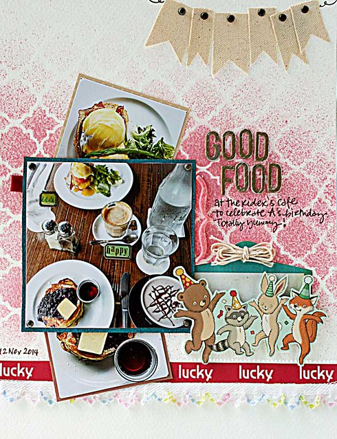
I have a confession....my phone photo gallery has more food photos than people photos. Seriously. *winks*
They get their 5 minutes of fame on my Instagram account...but I thought it was about time they get scrapped. So that when I'm old I can reminisce about how food used to taste like when I had teeth! *LOL*
Notice the strategically placed brads [the round ones and the ones with words] in the main photo?
They are there to form a "pocket" so that I can pull out the top and bottom photo. :)
Playing along with Let's Get Sketchy.


we always take food pics...it's an asian thing, eh?
ReplyDeleteLove the layout.
....& I'm about the same as you....so you usually Instagram them, too!!! I REALLY like how you can put the other pics behind....those little critters are fun & twine bows. They look CUTE!!! More inspiration for moi!!!
ReplyDeleteFabulous layout.. but I had to smile at your comment about doing a layout about how food used to taste when you had teeth..hehe.. I hope this layout brings back many yummy memories!!
ReplyDeleteThis is AWESOME!! I love love love how you made the 'pocket' to add the extra photos and loving the banner and the cute animals!!!!!
ReplyDeleteThis is super cute and fun...I love those little figures...and those food pictures, what can I say but yummy!!! I suddenly feel hungry too.... Must not forget to say thank you for ålaying with our challenge at LGS :)
ReplyDeleteYou scrap food photos so beautifully Yvonne ! I loved the idea of pulling out photos and those critters are cute ,fun !
ReplyDeletewow love that banner and the background is perfect.. what a YUMMY layout.. heehee
ReplyDeletePics are beautiful and the misted bg is beautiful for pics.. :)
ReplyDeleteAwesome page! Love the yummy looking food too! Fabulous background stencil!
ReplyDeleteYUM! Love this! And food, too! ;)
ReplyDeleteThis looks adorable, love the cute image of dancing animals and of course the spritzing on the BG :)
ReplyDeleteThis LO is spectacular!! LOVE everything about it!
ReplyDeleteFantastic layout! My layout for this week also has food! Why not scrap the yummy things!! Thank you for joining us again at LGS!
ReplyDeleteThat pocket is awesome. I love taking food photos. Food is such a cooperative subject and never ends up with a weird eye blink or expression.
ReplyDeleteLOL - I almost spewed water all over my monitor when I read the line about remembering what food tasted like when you had teeth!! Heehee!! This is fabulous!! And the food looks so yummy!! Have a great day :)
ReplyDeleteLisa
A Mermaid's Crafts
Such a wonderful LO. I love the animals! TFS
ReplyDeleteSuper cute page. Thanks for playing at LGS.
ReplyDeleteIf my photos were as good as yours, I'd take more food photos too. And this layout is darling.
ReplyDeleteLove food photo layouts!! And such a fun way to use the brads on the photo, Yvonne!!
ReplyDeleteI'm sure you'll always have teeth but your taste buds may get old....LOL! I am also a foodie photographer....when I remember not to chow down first..hahaha! The brads used to make pockets is a brilliant idea.
ReplyDeleteI did notice the brads right away, yes! They look so cool, and say what??? they form a pocket? That is seriously genius, my friend! You are amazing!
ReplyDeleteYummy page! You always make your page cool, fun and beautiful! Thanks for sharing this at LGS! Happy to see you again!
ReplyDeletefab layout and btw. your cool insta food photos have me drooling every single time :-)! Hugs, Sanna
ReplyDeleteGreat pics, great layout. Thanks for playing along at LGS!
ReplyDeleteyour misting is amazing!!!! LOVE This page!!! thanks for playing along with LGS!!!!
ReplyDeletesuper page.. great content.. fun accents and design using the LGS sketch
ReplyDeleteWhat a fun page. I see how you used different aspects of the LGS sketch. Thanks for joining our challenge
ReplyDeleteAwesome layout - luv the banner
ReplyDeleteThank you for playing along at Let's Get Sketchy
Wow! incredible page Yvonne! Thanks again for joining us at LGS :)
ReplyDeleteSuper fun page. Love the masking work. Thanks for playing along at LGS!
ReplyDeleteGreat take on the challenge, thanks for joining us at LGS! Happy New Year!
ReplyDelete