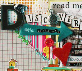
I love to incorporate fun elements on my pages. But I also like my layouts to be relatively flat [
way easier to store!]. Today I'm sharing 10 {non-bulky} ways to add interest to your layout. :)
1. Incorporate fussy-cutting.
I like to stick the middle parts down so the sides stick out a bit...creates the illusion of dimension [
while staying flat in your page protector].
2. Add a little handstitching.
I love to randomly poke holes and then use different coloured threads to add a little fun! [
I find this especially useful for hiding the fact that I forgot to ink the edges and when the patterned papers don't blend well together.]
3. Create an embellishment cluster.
Grouping elements of different textures add a playful feel to your piece. Try adding buttons, brads and found ephemera.
4. "Embellish" your photo.
I love to journal and paste stickers on my photos [
especially of places and things]. Use arrows to pinpoint to something significant on your photo. [
I found a cool book in the bargain bin! ] It's a great way to add random journaling bits to your layout.
5. Create a fun background by using a mask amd mists.
6. Play with fonts.
This could be your title work or your journaling. I love to incorporate my own handwriting too. It helps to tell the story in a more interesting way than a block of journaling.
7. Stamp.
Use fun picture stamps to tell your story. :)
8. Go crazy with stickers.
I love to mix it up with lots of letter and word stickers. Paste them on a chipboard and you get a dimensional chipboard element...the possibilities are endless! ;)
9. Include "white" space.
"White" space prevents eye fatigue and gives your eyes a place to "rest" so as to better appreciate all the elements on your layout. It doesn't necessary have to be white in colour though....I consider my masked and misted background my "white" space. The next point reinforces the importance of "white" space.
10. Ensure a continuous flow of elements.
When you have a continuous flow of elements, you help guide a reader's eye through your layout. Try to keep some parts light and your focal point a little "heavier" with elements.
There you have it, my 10 {non-bulky} ways to add interest to your layout. :) Do you have any to share?
Supplies: Cosmo Cricket patterned papers, Maya mists, American Crafts thickers and stamp, Fancy Pants chipboard, Adorn It, SRM and Sam & Lucy letter stickers, thread, doiley, grid mask, brad, charm, buttons, white pen, black pen.
P/s: This layout was done specifically for my guest designer gig at
Bird is the word. It features a quaint little bookstore in Wentworth Falls. :)


