So I've been simultaneously trying to tackle my stack of 12x12 patterned papers as well as my (super fat) single file folder with divided sections of paper scraps. Typically I would pull a sheet of 12x12 patterned paper as my base, then try to piece together the whole things using my scrap stash.
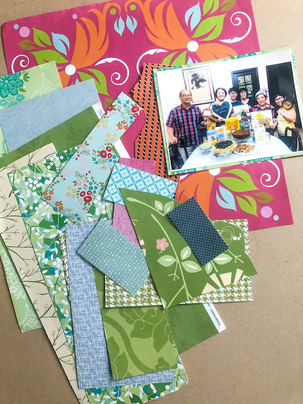
Even though I would usually pull out random pieces from the scrap folder to "build" the layout, this time I pulled out the patterned paper pieces that kind of "go" with the bright patterned paper base I had chosen just to share a little of how my "creative" brain works. *winks*
As for the choice of the patterned paper base, you can choose colours that either match your photos or complement your photos. Don't worry too much about the actual pattern "clashing" with your photos because you can use a mat on your photos to break up the busy-ness of the patterns.
You can apply some tried and tested design rules here...like dark colours recede and brighter colours enliven a layout.
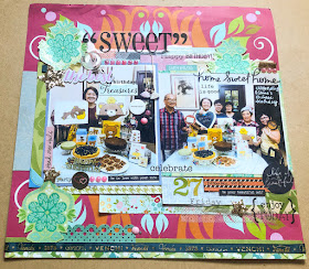
Since we were celebrating my sister's birthday on this layout and we had a cutesy Rilakkuma-themed party, I went with a bold brightly coloured patterned paper as the base for my layout.
Now, you don't have to choose sooooooo many patterns to work with, especially if patterns intimidate you. I really wanted to challenge myself and use up as much scrap stash as possible. :)
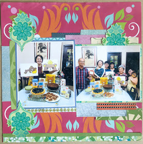
Here was how the layout looked when I incorporated the patterned paper scrap pieces I picked out.
One of the easiest ways to use patterned paper scraps is to cut them into smaller pieces and just tucking them under the edges of your photos to create a "dimensional" mat. You can vary the colours and patterns to achieve a pleasing colour/pattern combo.
On this layout, I used rectangular pieces of scrap paper (because I was lazy..hehe) but you could also round the edges and use a border punch on the papers to create more details and interest to your piece.
I did, however, fussy-cut the floral pattern to create a visual triangle so that the eye can focus on the photos instead of being distracted by the numerous patterns on the layout. And in case you were wondering, I did use every piece of patterned paper scrap I chose (see photo #2) albeit in smaller bits.
My next step is to "texturize" my layout ...of course, with more patterns (the more the merrier..haha).
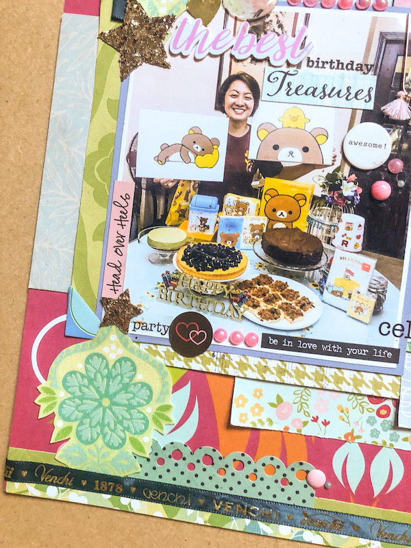
Since the only "dark" colours are in the photos, I grounded the layout by adding a dark green printed ribbon (chocolate packaging) at the base of the layout. I also added word stickers on the photos to guide the eye to the photos. While the human eye loves to look at colours, the human brain loves to read text. Which is why I like to do my journaling on the photos or near the photos.
I used a super large sticker for my titlework... that helped to guide the eye down to the photos.
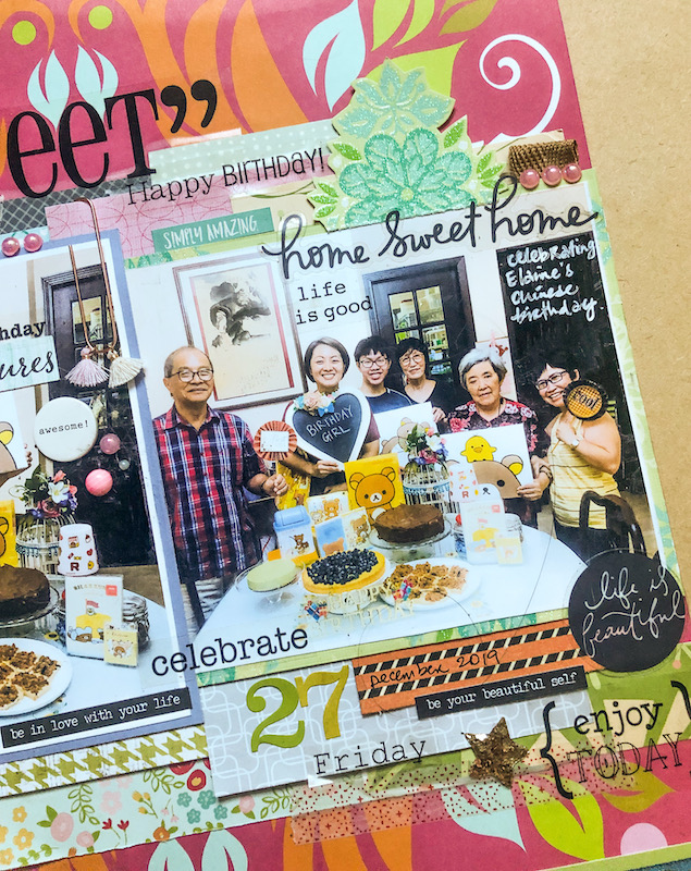
To "break up" the patterns, I like to do embellishment clusters around the photo edges. Personally I'm drawn to tactile elements so I like to incorporate bits of ribbon scraps (in the form of tabs at the edges), dimensional stickers and chipboard pieces.
Vary the sizes and colours to create a visually pleasing cluster.
Washi tape is a great way to use patterns on a layout in a less obtrusive way since it is semi-transparent. I like to use washi tape as additional adhesive insurance as well as a "mat" for my clear stickers.
There you have it...how to work with patterns on a layout. Do you like to work with patterns on your layouts?



You ALWAYS make patterns work!!!! I loveeeeee this! The added green is perfection!
ReplyDeleteI am amazed by your ability to bring together so many patterns , textures together into a beautiful layout ! I will go crazy if i had to use these many elements !
ReplyDeleteBeautiful job, as always. You are the Pattern Master!
ReplyDeleteOh, I learned something new today, adding text near the photo to draw focus on it. Brilliant! Thanks for sharing so many scrapbooking tips in this post.
ReplyDeleteHeaney
Great layout and explanation. I also try to use up scraps in anything I craft. I learn a lot from you...thanks!
ReplyDelete