Pages

Wednesday

This week's quick decorated mooncake box


Hello there friends! I'm in Sydney, Australia this week and I wanted to share a quick decorated mooncake box I made for my Aussie mate. I got invited to her home for lunch and my box matched the napkins her husband laid out! :)


This mooncake box had some lovely gold embossing on the edges and gold chipboard piece in the center. I just added some chipboard Christmas pieces and called it done!


I didn't mess match with the cover because it was covered in silk material and looks really lovely on its own.


Here's a side view of the box.


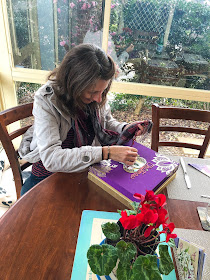
And here is my friend celebrating Christmas in July. Any guesses to who she might be?? *winks*


Share/Bookmark

Monday

Make Stuff Monday: Quick projects (the lazy crafter edition) *winks*


Since I do most of my crafting on weekends, sometimes I like to do quick projects instead of spending hours on them to maximize my output. Like these superquick "upgrades". *winks*


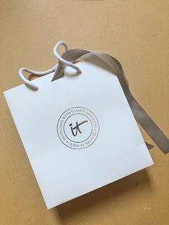
The paper bag is from an event I attended with IT Cosmetics - a sturdy white paper bag with silver sides and matching ribbon. The straw purse was a gift from my cousin.


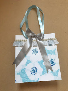
For the paper bag, I cut out patterned paper to cover the front and back of the paper bag. Then I adhered lace and pearl trim. It didn't need a focal point since I could tie the attached ribbon into a bow. I did switch out the bag handles for light blue ribbon to coordinate with the patterned paper.


For the straw purse, I found it a little too plain. So I added lace and pearl trim to the purse. I finished by gluing a bloom to the tassel. 

Happy week ahead friends!


Share/Bookmark

Thursday

The process of drawing my niece Luna in my sketchbook (tutorial)


Back in February, I shared that I was drawing my niece Luna in my sketchbook. Just discovered the process photos on my phone (when I got a warning that I'm running out of storage on my iPhone and got busy deleting my many food photos...you know, the bulk of photos on my phone..*winks*) so I'm sharing them today.

Disclaimer: I didn't go to art school...learned how to draw from a few online classes, reading a bunch of old art books at the library and practising on my own for the last few years. I wasn't the kid who was always sketching. I learned how to draw as an adult. So my "process" may not reflect the proper way one should approach a drawing. 


I started with a rough sketch in graphite pencil. Lots of artist books will tell you that the more accurate your sketch, the easier it would be to complete your drawing. And I agree. But that takes a long time for me so I just wing it and go for rough placement of features. *LOL*


Once I'm happy with my sketch, I take a kneaded eraser and go over my sketch to lighten the pencil marks because graphite does not play well with coloured pencils. Then I go in with my coloured pencils to draw the eye...because that's my fave feature. :)


I like to work on toned paper (this one is Strathmore Toned Gray sketchbook) rather than white paper because it saves time. The toned colour provides the baseline for the midtones that allows you to push either darker or lighter values in your drawing. If you work on white paper, you have to work from light to dark which takes a lot more time. (Now you know why artists tone their white canvases before painting..;)


At the beginning of your drawing, you want to be light-handed with your coloured pencils. Coloured pencil drawing is a rather slow medium and requires many layers of pigment to reflect the colour you want from your drawing. 

Also, when you colour lightly, you can easily erase your mistakes without ripping a hole in your paper. 

Understanding basic colour theory will help you greatly in choosing the mix of colours to use. I used the Faber Castell Polychromos for this sketch.


I like to repeat the use of certain colours throughout my drawing so that there is cohesiveness and harmony in piece.


If you like a smooth paint-like finish to your drawing, you can burnish your drawing with a colourless blender or a solvent (rubbing alcohol, acetone nail polish remover, odourless mineral spirits or turpentine) before fine-tuning the details. It would remove the graininess of your drawing. Personally, I don't like using the solvents and burnishing is hard labour. Plus I actually like the raw grainy look of a somewhat "unfinished" drawing like all of mine...hahaha. 


For the highlights, I like to use a white paint marker/gel pen.


If you were wondering why I didn't complete the drawing based on the photo, it's because I got tired. I mean this took many many days. Plus nobody will know that once I cut the piece out from my sketchbook and put it in a nice frame. Except you. But you won't tell on me because we are friends right???


Share/Bookmark

Wednesday

Travel diary: Chatuchak Weekend Market in Bangkok


I was recently in Bangkok and flew in on a Sunday just so that I could visit the Chatuchak Weekend Market. It's only open on Saturdays and Sundays.


It is a HUGE market - the largest in Asia - and they sell everything - from food to plants to shoes to bags to clothes to pets to (insert anything you can think of). Yep, you can download an app to help you navigate through the massive market. I spent 4 hours there and probably covered like 1/10 of the place.


Local handicraft....I was tempted to get the wooden owls but I didn't.


If you want to get local souvenirs, this market is your best bet. You can bargain a little but prices here are already pretty cheap. 100 Baht is about US$3.25.


Kitchenware.


Plants and stuff for your garden.


Tropical fishes. So cheap! If only I could bring them back home. I even saw cute puppies on sale for 500 Baht = US$16.25.


Crochet stuff.


Shoes!


Watches.


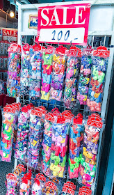
Accessories.


I really wanted a beaded bag but it was US$50 which is a little too expensive for me.  Guess not everything is cheap...*LOL*


Of course, I had to stop for a drink....I went for the cantaloupe juice, served in the cantaloupe with dry ice and added cute stuff for maximum drama. ;)


I particularly loved the artist section. Check out those hand-painted straw bags! Yes, spoiler alert: I see myself painting on some straw bags in the not so distant future! ;)


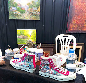
And the incredible details on the painted sneakers.


The amazing metalwork with recycled metals.


How cute are these dogs? They are made from recycled pencil sharpeners and fan parts.

I picked up some cute stuff of course. You didn't think I would leave empty-handed did you? *winks*


Share/Bookmark

Tuesday

How to create fun embellishment clusters on your creative projects


Hello friends, you know how I love to fussy-cut elements from patterned papers and create fun embellishment clusters? The ones that don't really make sense (usually involve some bird or cute critter) but somehow look somewhat decent and pleasing to the eye? *LOL*

Well, today I try really really hard to break it down and explain how I put together those fun embellishment clusters on my projects. So grab a beverage of your choice (Hey waiter, can I get a whisky on the rocks please? It's happy hour here when this post is live. *winks*) and let's get started.

Using-my-paper-scraps-on-my-traveller's-notebook
Using my paper scraps on my travel journal

1. Stick to a limited colour palette.

The key to creating a cohesive look (even if the elements involved seem odd) is to pick elements within a set colour palette. They don't have to be exact colours...tonal variations work too!

Picking three or four colours is the "safe" way to go. Here I went with a neutral background and took the colours off my washi tape (under the ampersand) to pick elements for my cluster.


The-one-about-the-lame-mooncake-making-session
The one about the lame mooncake-making session

2. Overlap the elements.


You know the famous John Donne quote, "No man is an island."? Well, it applies to embellishment clusters too. Don't let your any of your elements be lonely...give them some friends or competition. to help them stand out more. It's like when one of my aunts got married...she chose two of her "ugliest" friends to be her bridemaids so that she would be the prettiest one in comparison. (Now I wasn't even born yet when she got married but I did see the photos...*LOL*)

Anyway, overlapping your elements makes it seem deliberate..you know, like you really know what you're doing, style-wise.*hahaha* And a great way to use up torn/partial elements too. I tend to use them to cover odd corners and "mistakes" I made.

Pasta-and-waffles-for-lunch
Pasta and waffles for lunch

3. Repeat your elements.

The appearance of repeated elements really helps to pull your piece together. Bonus points if you triangulate your repeated elements to really help the eye navigate through your project. Here I used flowers and butterflies.

Working-off-the-cheese-tart-at-the-playground
Working off the cheese tart at the playground

4. Create a "fun" scene.

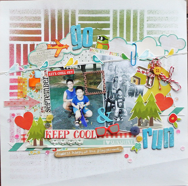
I'm all about creating fun "scenes" on my projects even if they don't seem logical. It makes me happy...and yes, I giggle when I'm putting them together. And the Gangster Gang (aka niece + nephews) get a kick out of the fun "scenes" when they flip through the scrapbook albums.


There you have it. 4 ways to create fun embellishment clusters on your creative projects. :)


Share/Bookmark