 |
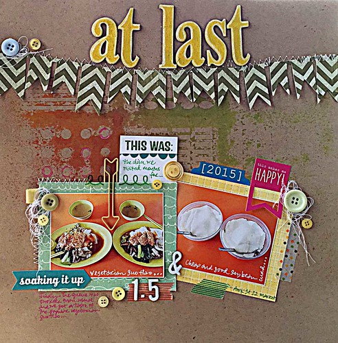
| At last |
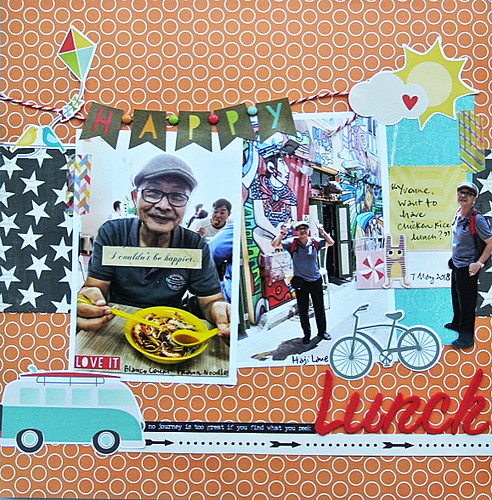
If you've ever been to Singapore, you would know that queuing up for good food at hawker centres/food courts is a norm. And it can be rather discouraging when your taste buds want to savour the food but the physical body does not want to wait in line to purchase said food. You know, life's hard.*winks* So when you happen to be in the vicinity of said food and the queue is wayyyyyyyy shorter than usual, you jump at the opportunity to finally satisfy your taste buds....and of course, make a scrapbook page out of it. After all, it is a momentous moment in life right? *LOL*
On this layout, I went with At Last by Etta James. :)
2. Incorporate fun text/quotes.
I love to use fun sticker text/quotes on my layouts to help tell my story. Like the van driving down the road with the quote " No journey is too great if you find what you need..." and ending with the journey being lunch! *winks* Well, you know I did walk to the lunch place in 4 inch heels in the sweltering heat!
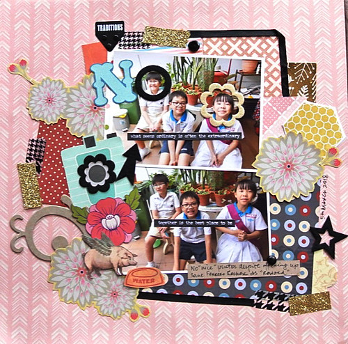 |
| Will I ever get a nice photo? |
3. Include a flying pig drinking water out of a dish.
Of course, in my already "overdone" layout with an overwhelming mix of patterns and colours, I just had to include a flying pig drinking water out of a dish because you know, I'm so extra. Hahahaha!
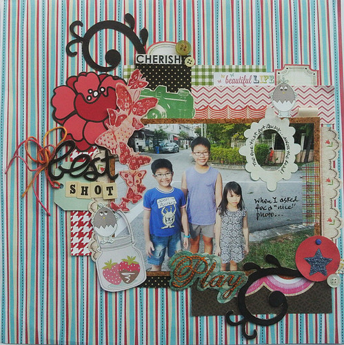 |
| When I asked for a nice photo.. |
4. Use ONE large photo that tells the story.
Sometimes you get that one perfect photo that sums up your story succinctly. No, not the one where everyone is smiling sweetly at the camera, the stars are aligned and you get that perfect shot where no one blinked or tried to be funny.
It's the one where almost everything is wrong with the photo but it tells the whole story. You know. Story of my life with The Gangster Gang (aka niece + nephews).
In my photo, the niece looks a little disgruntled, nephew #2 is trying too hard with the oversmiling and of course, nephew #3 is wayyyyyy back across the road (see frame).
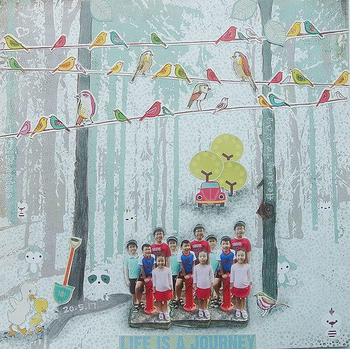 |
| Posing at the fire hydrant |
Gather all your fussy-cut cute elements and create a fun little fantasy "scene"...it's so much fun to play with scale and proportion to create your "scene"! :)
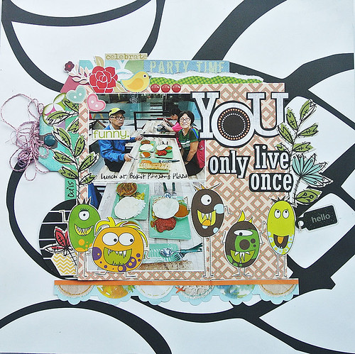 |
| You only live once |
Yep, this was way back when dad hasn't quite understood that "the camera eats the food first"...check out his "not-so-happy" face about having to take a photo before eating as opposed to mum's happy face. Of course, the title is quite apt since they were indulging in rather unhealthy food. And, those monsters are clearly playing the devil's advocate! Hehehe!
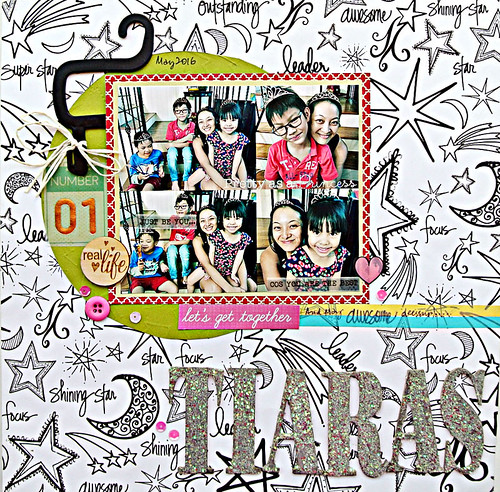 |
| It was a tiara-wearing kind of day... |
7. Make your subjects wear tiaras so that everyone can look pretty!
Well, you know me and my maximalism...of course I would have multiple tiaras to "dress" up my subjects. And the nephews enjoyed their "pretty" moments. *LOL*
Well, you know me and my maximalism...of course I would have multiple tiaras to "dress" up my subjects. And the nephews enjoyed their "pretty" moments. *LOL*
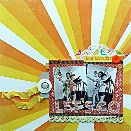 |
| The need for self-preservation |
Nephew #2 and #3 were playing with their guns and drill-made-to-be-a-gun as usual so I got them to do the classic Charlie's Angels gun pose...you know, for a bit of fun! ;)
There you have it...how to incorporate humour in your layouts (Part 2)....which one made you laugh out loud??


Most of your lo's make me LOL!!! I always LOVE your humor!!!!! These are awesome ideas!!!!!!!!!!
ReplyDeleteHaha - they all made me laugh out loud!! You are so funny and clever!! Number 3 is so hilarious - the flying pig drinking water!! Love them all!! Your layouts are always so amazing!! Have a great day!! Big hugs :)
ReplyDeleteLisa
A Mermaid's Crafts
What a cool post Yvonne...you make layouts seem so easy ...very inspiring
ReplyDeleteCheers
Dr Sonia
Tip #3 is oddly specific! LOL!
ReplyDeleteYou are "so extra".... hahaHA, you always make me laugh! And I love that you are, because your layouts have such a playful, unique quality about them that I absolutely adore! Everything you make brings a smile!
ReplyDelete