

I love using bits of found and random stuff on my projects and try to make them "work" somehow. I shared my tips on how to use seemingly disparate elements on your layouts back in August. Here is Part 2.
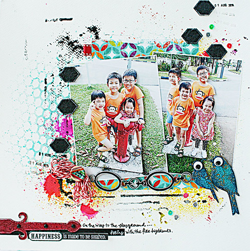
1. Use a dark grounding colour to help guide the eye across the layout.
On this layout, I repeated the black paper strips as markers to guide the eye across the photos right down to the titlework and journaling.
2. Create a "frame" with your elements.
Here I used the chipboard pieces - the hexagon ones and the birdies - to "frame" my photos.
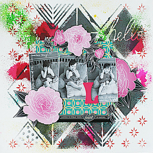
3. Go with the visual triangle.
On this layout, I played with the visual triangle in a couple of ways - a. I placed the photos within a triangle; b. The fussy-cut big blooms form a triangle to "frame" the photos; c. There are triangles in the misted background design. |

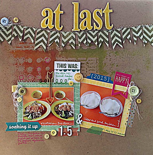 |
| At last |
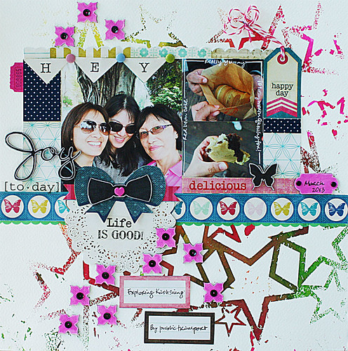
Repeating a shape on your layout helps to tie everything together somehow. Here I used the circle shape - in the photos, the buttons, the circles on the misted background, the circles on the polka-dotted washi tape.
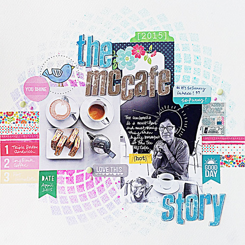 |
| Why we need an umbrella indoors: the McCafe story |
Incorporate a product shot (the food) and a user shot (my mum), throw in a testimonial ("It's so sunny in here!"), a summary of the main selling features (#1 - 3), a caption to draw the viewer in (The McCafe story) and finish with some happy elements (bird and flowers) and colours.
 |
| The story about the red bean cake |
It may not be obvious here since my layout is so colourful but I used the hot pink throughout the layout as a visual marker for the eye (the chipboard flowers, the ribbon center and sides, the scroll chipboard, the ticket tab).
 |
| A layout by Yvonne Yam for Maya Road/Ruby Rock-It swap |
You know how it is with your inspirational board at home - you just put stuff you like on it. Apply it to a layout and you have a bunch of random stuff that somehow works together! *LOL*
There you have it. Another 7 ways to use seemingly disparate elements on your layouts. Do you use any of them?
You are a rock star! I loveeeeeeeee these tips!!!!!!!!!!!!!
ReplyDeleteFabulous tips and amazing projects!! Have a great day!! Big hugs :)
ReplyDeleteLisa
A Mermaid's Crafts
Fabulous tips! Your scrapbook style is so much fun!
ReplyDeleteThanks for the tips! You make it seem so easy; maybe even I could do it. Your layouts are so pretty and appealing.
ReplyDeleteFreaking LOVE your layouts, Girl! And you always WOW with all your tips and design ideas!
ReplyDelete