Pages

Thursday

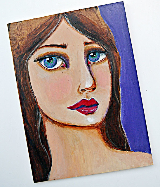
Another girl on a wood panel...*winks*


Another-girl-on-a-wood-panel

Oh well, you know how it is with me. When I get obsessed with something, I just have to get it out of my system. Like paint 4 girls on wood panels over a weekend. *winks*


A mix of acrylic paints, coloured pencils and inks....


Yes, my girl looks a little melancholic....


But I had fun painting her! :)

Share/Bookmark

Tuesday

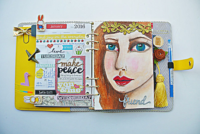
Embracing the cute stuff....


Embracing-the-cute-stuff...

One of the reasons why it took me so long to get in on the planner craze was because I love the cute stuff....but can't imagine using it in public. [The cutesy stuff doesn't exactly lend itself to adult credibility...] *LOL*


Now that I've decided to use it at home as a journal, I can truly start embracing the cute stuff! Yay! *high fives all around*


And add my mixed media spin on it too. :)

Share/Bookmark

Monday

A quick decorated box....


A-quick-decorated-box

So I finally discovered how useful it is to have decorated boxes/gift wraps all done up and ready-to-use at a moment's notice. Especially when your mother always has something to give to someone....*winks*


Now all sturdy cardboard boxes will get decorated and stashed away in a designated drawer for my mum to pick and choose. Great way to use up scraps, do a little bit of upcycling and score brownie points with the matriarch. *LOL*


I love this silk bloom (previously a napkin ring holder) because it has adjustable petals so it is easy to tuck things under after you glue it down.


I didn't have enough patterned paper to cover the entire box so I created a "front" for the box and went a little crazy with the embellishments and my hot glue gun.


Not too shabby for something done in 20 minutes eh? :)

Happy week ahead friends!

Share/Bookmark

Thursday

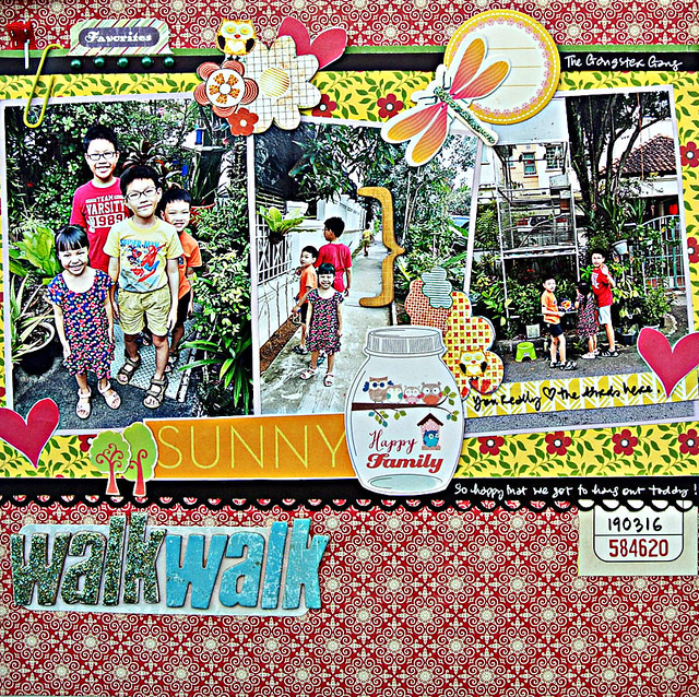
Out for a walk with The Gangster Gang...


Out-for-a-walk-with-The-Gangster-Gang

Last Saturday, I went out for a walk with The Gangster Gang [aka niece + nephews]....strolling down the same familiar path to check out the creepy crawlies, the neighbours' fish ponds and the kids' fave - a huge outdoor birdcage filled with lovebirds! :)


Of course, we had to take pictures along the way....note how camera-ready the niece is? Well-trained eh? *winks*


And yes, still furiously working through those patterned paper scraps...


Playing along with Stuck?! Sketches

Share/Bookmark

Wednesday

10 mixed media card ideas (Part 2)


You know that I'm a grab-and-go kind of girl when it comes to my mixed media cards. I like being spontaneous and incorporating the little bits that are found on my desk after working on a couple of layouts. Sometimes, they turn out pretty good *winks*...other times, I've had to do a lot of covering up work of course...*LOL* Here are 10 mixed media card ideas.

All cards are linked to their original posts.

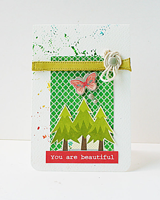
You-are-beautiful-card
Are you into social media?
1.  Add your "save-it-for-a-rainy-day" bits to create a "scene".

My card base is watercolour paper with residual mists (from another project). I rounded the corners and incorporated my "save-it-for-a-rainy-day" stash to create a cute little "scene". Yes, that yellow "trim" is the leather strap from an old shoe.:)

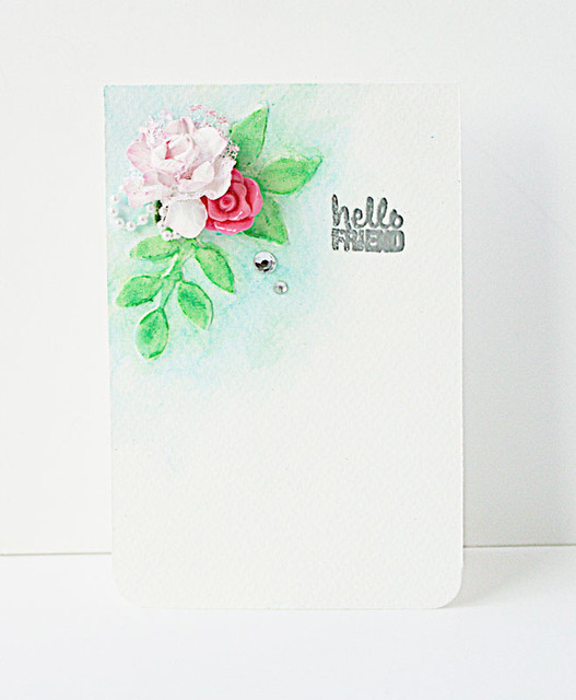
Hello-friend-mixed-media-card
A quick mixed media card
2. Mix it up!

Try some light modeling paste + Faber Castell gelatos for a soft watercolour look on your card base. Then jazz it up with a mix of soft and hard elements.

Pink-bow-mixed-medid-card-for-Maya-Road
The case for the no sentiment card
3. See a "design" in the abstract.

I love the abstract design created by residual mists and stencils and didn't want to cover that up. So I just added complementary textural elements to finish the card.

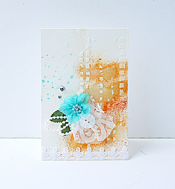
V-Day-card-for-CCB
A blue and orange card
4.  Try a vertical design to hide "flaws".

I didn't really like the pattern created by the residual mists so I added a darker orange mist which made it worse!  So I bloated some of the colour off with a tissue. It looked really bad at this point. Then I decided to apply modeling paste to create a vertical design to distract from the blob disaster. With the embellishment cluster, you (almost) can't tell that this card was so much trouble! *LOL*

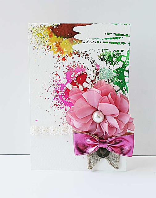
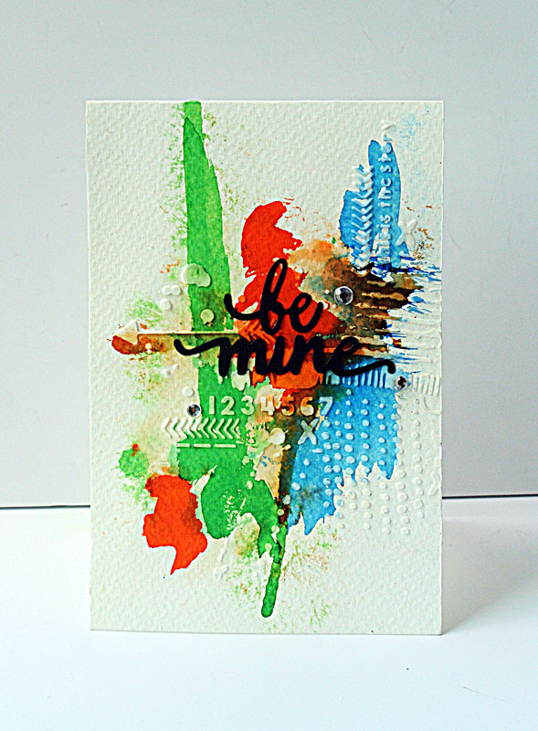
Be-mine-mixed-media-card
Using a few supplies to make a loud card

5. Use your colorants to create an abstract background.

Here, I started with light modeling paste and The Crafter's Workshop stencil. After that, I added Ecolines (liquid watercolours) with a paintbrush to create an abstract design. I finished by adding my sentiment as a focal point.


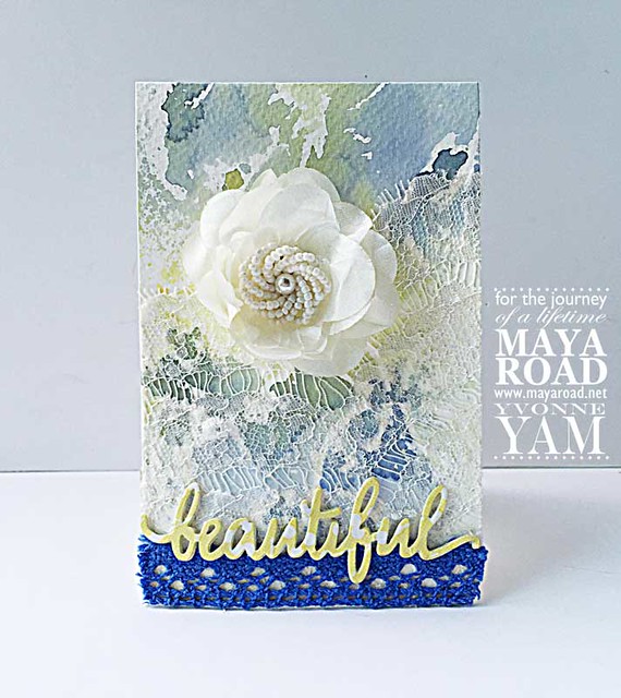
Beautiful-card-by-Yvonne-Yam-for-Maya-Road1
Love the look of peekaboo lace
6. Use fabric to create a romantic feel.

Sometimes when your background colours are too bold, you can add lace to soften the colours and add a romantic feel to your card.

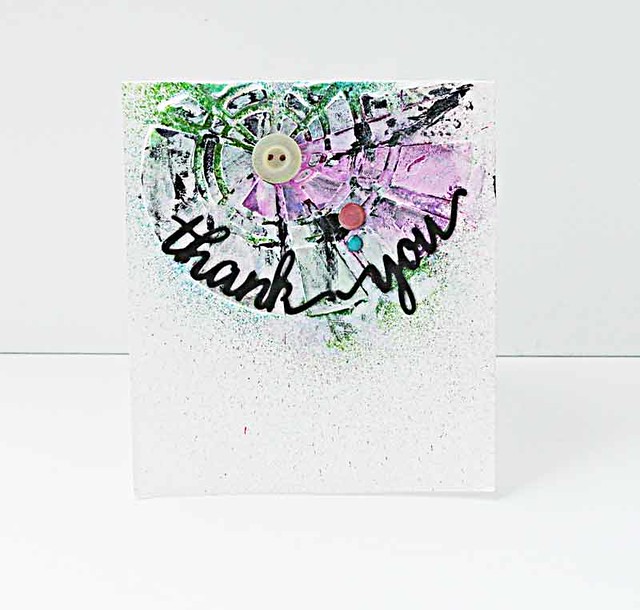
Thank-you-mixed-media-card
For the love of light modeling paste
7. Vary the way you apply your mediums and colorants.

There isn't just one way to apply your mediums and colorants. Even changing the order in which you apply them can create interesting effects.

For this card, I used Liquitex light modeling paste on a white card base. After that I added some mists. I finished by using white and black gesso with my fingers to create a more "artsy" look.

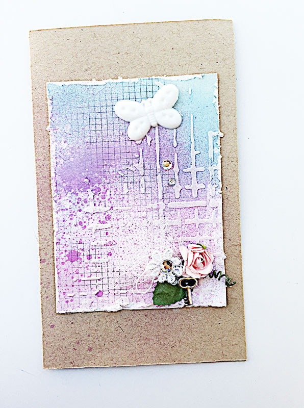
Purple-mixed-media-card
The 5am card
8. Extend the design of a patterned paper.

Like the design on your patterned paper? Why not extend it to create more visual appeal? I really love the soft colours and the grid pattern on this piece of patterned paper. So I added some mist to make it a little more vibrant, then added some light modeling paste with The Crafter's Workshop stencil to "extend" the design and make it more interesting.


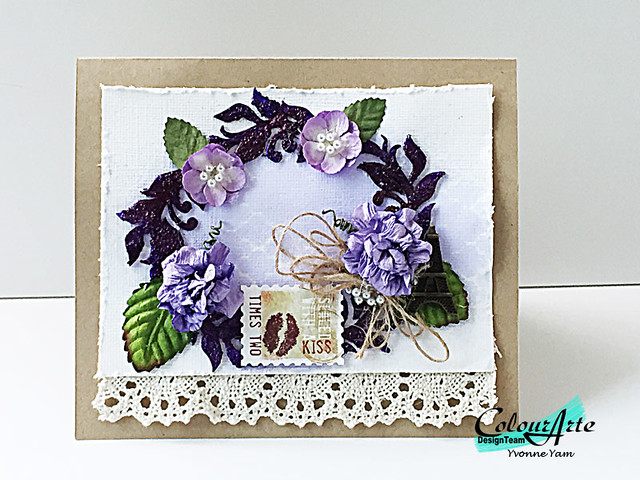
Sealed-with-a-kiss-card-by-Yvonne-Yam-for-ColourArte
Using purples and neutrals on a card


9. Play up the textures.

The white cardstock was lightly misted with a stencil for a subtle pattern. The chipboard flourishes were covered with Golden Glass Bead Gel and then coloured with ColourArte Primary Elements in a stronger pigment. Paper blooms in similar tones and neutral trim & twine were used as embellishments to complete this monochromatic card.

Always-mixed-media-card
Experiment with your mediums to create different effects
10. Work with watercolours and light modeling paste for a different effect.

The card base was created with splashes of Ecolines (liquid watercolours). When that was dry, I applied a layer of light modeling paste with The Crafter's Workshop stencil. The light modeling paste absorbed some of the watercolour to really create the depth of colour.

There you have it. 10 more mixed media card ideas. Do you have a fave?

P/s: For more mixed mixed card ideas, check out a previous post: 10 mixed media card ideas.


Share/Bookmark

Monday

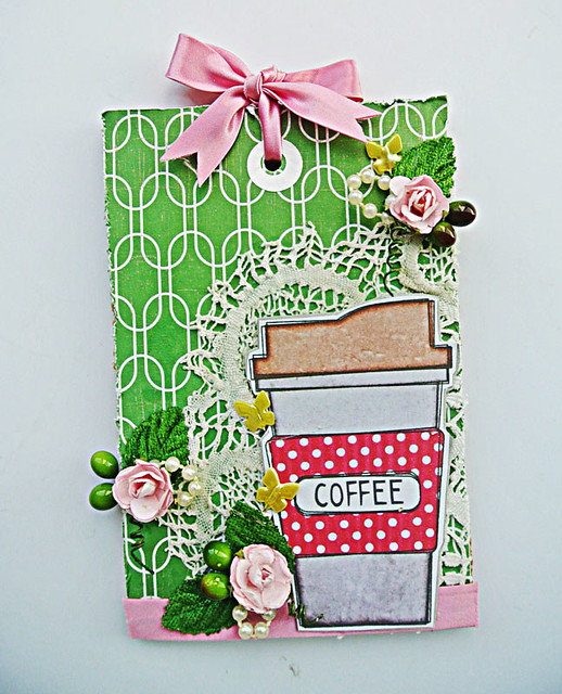
Spring coffee tag...


Spring-coffee-tag

I have been on a tag-making frenzy of late. It is a great way to use up patterned paper scraps and layer up the embellishments. [Plus I ran out of canvases...*winks*]


I love the "coffee cup" that my bloggy pal Lizzy Hill sent me....perfect for the Spring Coffee Lovers Blog Hop. :)


Happy week ahead friends! :)

Share/Bookmark

Thursday

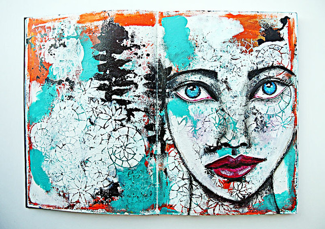
For the love of gesso....


For-the-love-of-gesso

Gesso is one of my fave art supplies. Seriously. 


Here's the proof that I mean business when it comes to gesso *winks*.... and Liquitex is currently my fave brand. :) 


I use the regular gesso to prep my journal pages and use the super heavy gesso with a stencil to add texture to my pages.


Gesso is basically plaster of Paris. It dries hard and a little stiff making it a great primer for thin pages as it makes them stronger. 


My art journal pages were done with a paint brush, acrylic paints, gesso and my fingers. :)


Playing along with More Than Words.

Share/Bookmark

Tuesday

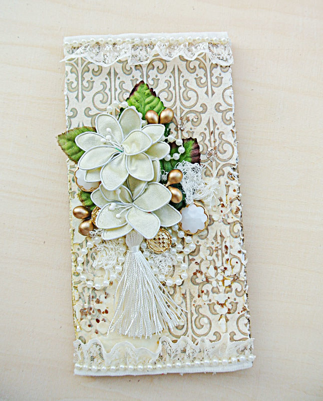
A quick mixed media tag tutorial


A-quick-mixed-media-tag-tutorial

These days, I've really been enjoying neutrals. The juxtaposition of hard and soft elements create interesting depth and texture in the absence of in-your-face colour. Like this quick mixed media tag.


I started off with a piece of cardboard. After cutting the patterned paper to size, I adhered it to the cardboard base and distressed the edges for some texture.


Then I applied some light modeling paste with The Crafter's Workshop stencil. Once that was dry, I lightly misted the tag with a gold mist for a subtle overall shimmer.


Next comes the fun part....the embellishing of the tag! I wish I could tell you there was a science or logic to my madness. But there isn't. I put an embellishment here, then tuck another one under it to create an overlap of sorts...then decide that it looks terrible....and add something else to make it look better. And in the end it becomes a decent cluster of embellishments. *LOL*


Of course, that isn't nearly enough. I have to add a little more "bling" with some Golden gold mica flakes. 


Because it matches the gold bits I have on my embellishments...*winks*


And then a little tassel for the "swish" factor. :)


Playing along with Creative Artiste Challenge.

Share/Bookmark