Pages

Tuesday

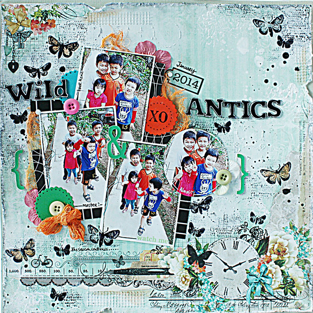
Wild antics on a layout....a tutorial


Wild-antics

Okay, your eyes are not playing tricks on you...I took a cue from The Gangster Gang [aka niece + 3 nephews] and engaged in some wild antics...on paper that is. *winks*


My layouts are usually story-driven and fast pages. This one wasn't. 


This one was started purely because I wanted to use Blue Fern Studios patterned paper that I won in a recent giveaway. Yes, the Shiny New Object Syndrome I suffer from is to be blamed! *LOL*


And play along with a couple of challenges...like Scrap Around The World and Scrap365.


That said, it was pretty nice just playing with stamps and mediums and seeing where it led.


Found these outtake photos of the Gangster Gang and worked them into the layout somehow. If you are interested in how I created this layout, scroll down for the tutorial. :)

_____________________________________________________


1. I started by distressing the edges of the Blue Fern Studios patterned paper with a distressing tool. You can use a pair of scissors for this. 

2. Then I applied a coat of clear gesso on the patterned paper. [Paper is porous so gesso helps to create a little "barrier" for mediums/colorants you add.]

3. Next I lightened parts of the patterned paper with watered-down white gesso. I also added some splatters. [Watered-down gesso creates a dreamy, translucent feel to the paper much like vellum.]

4. I added more texture by stamping with a Stampers Anonymous stamp. You can use an ink pad for more precise stamping. I used white gesso for a messy look.


5. I added some texture and interest by applying Liquitex Sand Resin with The Crafter's Workshop stencil. This dries clear and provides a very subtle texture.

6. Next, I stamped some butterflies on the patterned paper to mimic the patterns on the patterned paper. These stamps are from Viva Las VegaStamps. I also added some text stamping.

7. There was orange colour on the patterned paper so I used Tattered Angels Glimmermist in Peach Delight to paint my butterflies. 

8. Then I added some black splatters with Tattered Angels Glimmer Glaze. I LOVE this because it dries with a shiny and slightly raised finish.:) 


9. I decided on the photo placement and then adhered them using my Xyron Teresa Collins Mega Runner.

10. I created a little more interest around the photos by adding little bits of scrap papers and scallop diecut pieces from SRM.

11. Then, I added a little bit more stamping around the photos to create a more cohesive feel.

12. I misted some gauze with Tattered Angels Peach Delight Glimmermist and diluted it with some water to tone down the intensity of the colour.

13. All the dimensional embellishments were glued down with Xyron Teresa Collins Clear Hold Adhesive.

14. The American Crafts thickers I wanted to use had patterns on them so I coloured them with a Sharpie and outlined with a white pen for a little pop.


A few SRM Stickers, paper bloom petals, machine-stitching and journaling around the photos... and I was done! Love that my page is still relatively flat! :)

What do you think?

*Edited* This layout made Top 10 Honorable Mentions at Scrap Around The World and won the challenge over at Scrap365! :)


Share/Bookmark

Monday

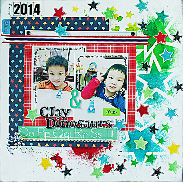
The one about the clay dinosaurs


Clay-dinosaurs

After attending a clay workshop, I proceeded to purchase air-dry clay and all the necessary tools so that I could "teach" the Gangster Gang [aka niece + 3 nephews]. Or so I thought...*winks*


Nephew #2 wasn't keen on listening to instructions and went right in to create his clay dinosaur.


Nephew #3 attempted a dinosaur...then proceeded to give his aunt [aka me] instructions to complete it....[Oh yes, I was "bullied" into it by his puppy eyes..*sob*]


The background was created with The Crafter's Workshop stencils and Dylusions ink sprays.


The American Crafts thickers had patterns on them that didn't match my layout so I coloured them with a black Sharpie and outlined with a white pen.


Playing along with Let's Get Sketchy.


Share/Bookmark

Friday

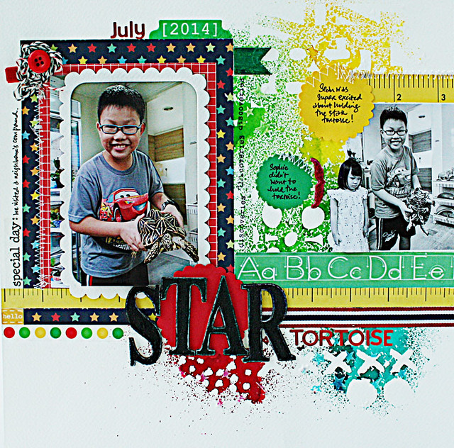
The story about the star tortoise


Star-tortoise

So the other day, while I was out for a walk with nephew #1 and my niece, we were invited to a neighbour's compound to check out their plants and pets.


Nephew #1 is a nature lover so naturally he gravitated to the neighbour's star tortoises. He was excited to take photos of course.


The niece wasn't that excited. Check out the photo...she was a little freaked out! *LOL*


Playing along with Once upon a...sketch and ARTastic challenge.

P/s: Happy weekend friends! :)


Share/Bookmark

Thursday

Why I love Silks Acrylic Glaze


It's no secret that I love Silks Acrylic Glaze. It was not love at first use though. Like most of the colorants I've bought, it took a while and a lot of experimenting before I "fell in love" with them! *winks*


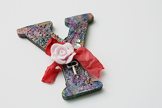
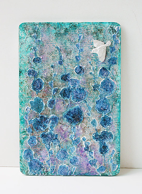
Wood monogram with Silke Acrylic Glazes

Silks Acrylic Glaze is a semi-gloss acrylic glaze. What makes it special is the mica flakes and mineral particles in the glaze. They somehow work together to refract light like a crystal, resulting in a beautiful shimmer and sparkle.


You don't need to use a lot to get spectacular results. Here, I prepped my wood monogram with mesh tape, wrapping tissue + a layer of gesso then just layered on the Silks. You can blend colours when they are still wet or wait for each layer to dry to create depth and richness of colours.


Mixed-media-wood-panel
Mixed media wood panel

They dry fairly quickly and you can add water to dilute them.

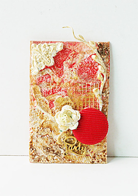
Party mixed media tag

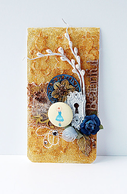
The sheen you get from Silks Acrylic Glazes is particularly alluring on patterned surfaces like lace.

Beautiful-mixed-media-tag-for-Imaginarium-Designs
Beautiful mixed media tag for Imaginarium Designs

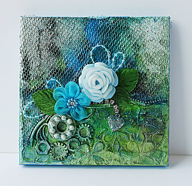
Or mediums like glass bead gel.

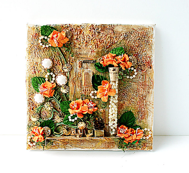
Mixed-media-canvas-with-found-objects1
Mixed media canvas with found objects

They are great for highlighting raised surfaces.

P/s: If you are lucky to have access to Silks Acrylic Glazes, give them a try! I can't get them locally so I only use them sparingly on the top layer of my mixed media projects.


Share/Bookmark

Tuesday

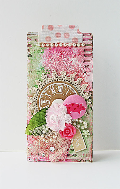
Mixed media card for The Crafter's Workshop...a tutorial


Mixed media card for The Crafter's Workshop

Hello friends! I love using cardboard for texture and dimension. Here's a simple way to create a mixed media card using good old packaging cardboard...
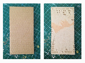
Cut your cardboard to size. Then tear off the top layer to expose the corrugated part of the cardboard.

Apply a layer of gesso. Then apply a layer of Liquitex ceramic stucco with The Crafter's Workshop stencil.


Then apply some Faber Castell gelatos.

Blend with water and a paintbrush. It got too pink so I added some green.

When that dried, I embellished my cardboard piece.


Then adhered the cardboard to a card base.


Share/Bookmark

Monday

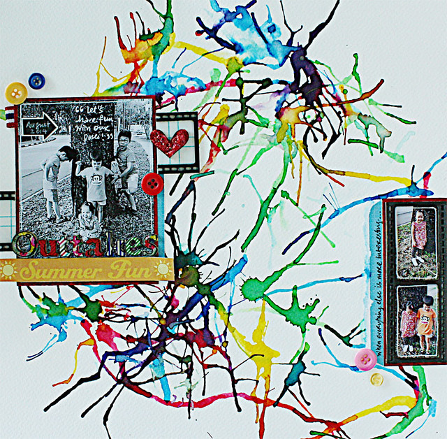
Summer fun outtakes


Summer-fun-outtakes

My fave photos to scrap are...the outtakes. Especially when the Gangster Gang [aka nephews + niece] is involved. It's hard for a kid to look really bad in a photo, eh? Now adults are a totally different story...*LOL*


There's always something far more interesting in the surroundings than the camera...*winks*


Lots of fun with the background - Ecolines [liquid watercolours], water and a straw.


Some paper scraps and buttons...

Playing along with Sketchabilities.


Share/Bookmark

Friday

A mixed media canvas with old computer parts...


Mixed-media-canvas-with-old-computer-parts

So I was invited to be a guest designer over at this new Russian challenge site Evolution Scrap. I could create anything I want as long as it reflected my personal style....


Which is at this very moment, related to old computer parts because I just hit the goldmine of found stuff - my dad's "save-it-for-a-really day" computer stash! *High fives all around!*


Here's a look at the canvas with the "raw" parts glued down with gel medium...and some fiber paste applied with The Crafter's Workshop stencil.


After a layer of gesso, I went in with Izinks - pigment inks which play like watercolours but dry permanent like acrylics. Now, I must admit, at this point, I had no idea how the canvas would turn out.


So I "auditioned" some flowers on the canvas...then added more colours with Silks acrylic glaze to create the illusion of depth on the background.


Most mixed media artist tend to add the background colours to the embellishments to "blend" everything together.  I prefer to pull the colours of my blooms and other embellishments and extend them to the background for a cohesive look and letting the embellishments "pop".


I included a test-tube which I filled with pearls for a little dimensional interest. [Yes, the test-tube was in my "save-it-for-a-rainy-day" stash...*winks*].

P/s: Happy weekend friends! :)

Share/Bookmark