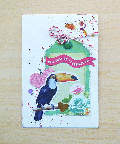
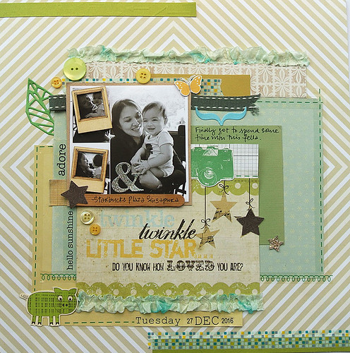
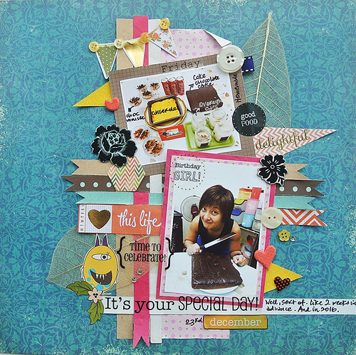
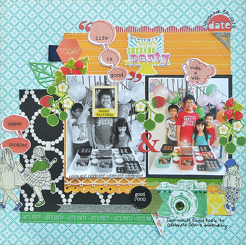
I'm sure many of you have noticed that I've pretty much stopped labelling the supplies on my layouts these days because there're just too many to list! *LOL*
My goal this year is to finish up my paper scraps [
which I mentioned previously were all housed in a single multiple-slot folder that is actually bursting at its seams...hehe] so at every chance I get, I'm incorporating those paper scraps. *empowering music plays in the background*
If any of you are drowning in paper scraps like I am *high fives all around*, perhaps my layouts can inspire you to get your paper scraps dwindled down to a manageable amount? [
One can dream...haha] Here are 9 ideas to use up those little bits of paper scrap on your layouts. :)
1. Go with a colour theme
When faced with a mountain high of paper scraps, it can be overwhelming to know how/where to start. Why not pick up paper scraps based on a colour theme? Personally, I like picking three base colours and using them in different shades for interest.
2. Create fun scenes
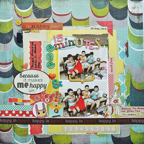
These are a great way to use up those fussy-cut elements like birds, butterflies and other critters. Mine generally don't make sense in the larger scheme of things...*LOL*
3. Go with paper strips
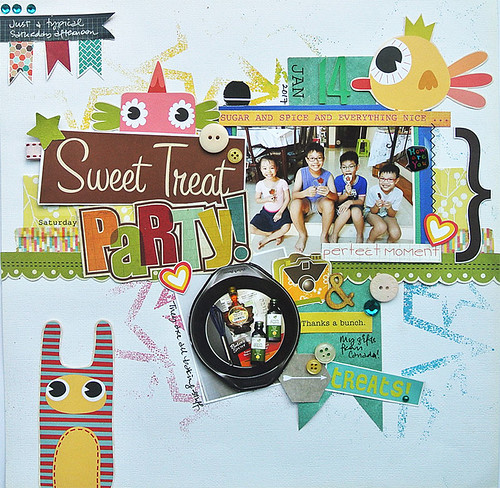
The patterns don't even have to match...the same width creates harmony and pulls them together. Somehow. :)
4. Help guide the eye through the busy patterns with recurring colours
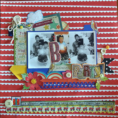
Colour can be a great way to help guide the eye through messy situations. Here I used red and green elements that appear to be scattered all over the place but actually help to "frame" the photos on my layout.
5. Collage papers to "frame" your photos
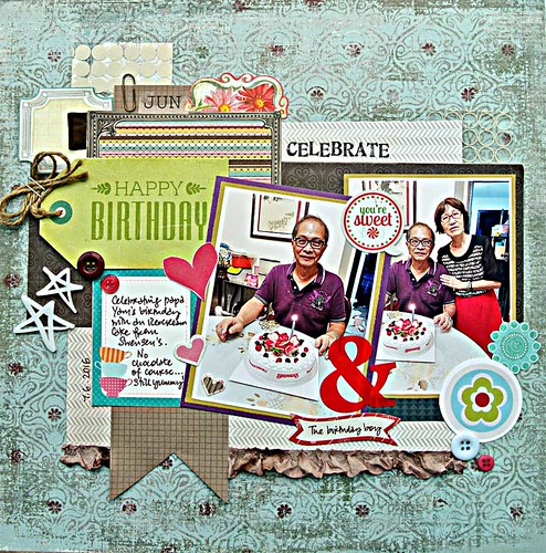
When you don't have a large-enough paper scrap for a photo mat, piece together little bits to form a collage mat to "frame" your photos. You can distress the edges like I did for added texture and interest.
6. Use repeated shapes to tie the layout together
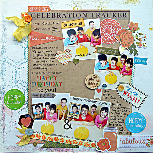
You know that I'm a glue-down-as-I-go-kind-of-girl so repeated shaped elements help to pull the pieces together. Notice that I like to use buttons? Particularly round ones??? *winks* On this layout, I used several shaped elements - stars, hearts and circles.
7. Use cute critters...okay use the visual triangle.
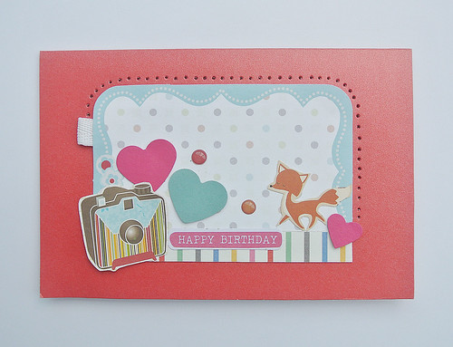
They say three's a crowd. Not when it comes to design apparently. Place your elements in a visual triangle (even better with cute critters...*winks*) and it instantly creates balance and structure for any messy layouts.
8. Embrace the grid
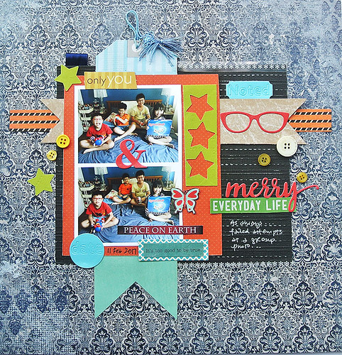
The grid system has a way of aligning elements so that they look neat and ordered even though they are not if viewed separately. The majority of the elements on my layout fall in the "grid" with a little overspill for a little visual interest. :)
9. Create a roadmap for the eye
Even when your layout has a lot going on, you can help guide the eye by using "pointers" like arrows or flags. On my layout, I added an orange "fun times" flag as my starting point.....which pointed to the first photo which led to the second photo....et cetera... creating a visual flow.
There you have it....9 ideas to use up those little bits of paper scrap on your layouts. Are you inspired to try out any of them?
P/s: Signing off for the week to enjoy the long Easter weekend....hope yours is fun too!:)

